Place in Time - Geolocation based history app
Project 2 - Interactive Front End Development (Code Institute 2020)
Ever wondered about the history embedded in your immediate surroundings? Whether you find yourself in places familiar or otherwise, Place in Time will bring the history of that locality directly to your fingertips.
Place in Time is a user friendly information trove that seeks to bring the life of old buildings and places very much into the present day, where you are always only a few touches/clicks from a fascinating piece of history.
Demo
Clicking on the screen below will bring you to a live demo. Right click and select "Open link in new tab" to open the demo in a new browser tab.
UX
As a tourist, I would like to learn more about the backstory of my current location and other locations within reasonable driving distance. In doing so, I can place myself in old stories which bridge the gap between past and present and enhance my sense of cultural enrichment.
As a native, I would like to gain knowledge on the historical significance of buildings and places in my general area, both familiar and unfamiliar. In doing so, I can develop a deeper understanding of how the native traditions and surroundings were shaped over time.

Strategy
The design is intentionally simple and uncluttered. The information takes a position of primary importance, where interactivity options are obvious, intuitive and unobtrusive.
Scope
Tourists and natives with an interest in history can have their location detected, before being served a selection of locations on a map, starting with the closest option.
Structure
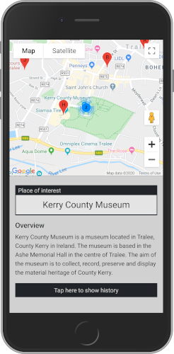
As the app is primarily suited to mobile use, it is important for the map to utilise the maximum amount of screen space without compromising the core information content. The currently selected location is displayed in an eye catching box in the centre of the screen, with an overview immediately beneath. Historical information, when available is accessible through a button prompting the user to interact.
Skeleton
Surface
The user interface is centered on the map element, which occupies half of the initial screen height. The map contains colourful points of focus for ease of navigation. The colour scheme and fonts for the location heading and history section were chosen to present the information in a simple yet attractive manner, while complementing the map above.
Features
Existing Features
Welcome Modal - presents users with some helpful information and operational instructions before they see the app.

Google Map - shows users their current approximate location on the map, following a request from the browser to access their approximate device location.

Google Map Markers - shows users the closest places of interest by way of map markers, which when clicked will update the information on the page.

Bootstrap Accordion - allows users to expand the history paragraphs section when tapped, and hide the history again if opted.


Responsive Footer - presents the user with an easy way to return to the top of the page, by appearing after a predefined scroll distance.

The functions related to the modal, accordion display message and responsive footer can be found at file path:
assets/js/transport-features.js
Features Left to Implement
Search - would allow users to target a specific location, by entering the place name in a search bar.
Favorites - would allow users to store their favorite locations for future reference, by tagging a location using a button located in the information space.
Pictures - would allow the user to preview the location visually, by displaying a selection of images in a carousel viewer.
Language - would allow users to select a preferred language for page contents, by selecting their language from an options menu.
Technologies Used
JavaScript - The project uses JavaScript to add dynamic functionality to the user experience.
HTML5 - The project uses HTML5 to structure the page contents.
CSS3 - The project uses CSS3 to style the HTML elements.
Bootstrap - The project uses the Bootstrap library, which makes the content responsive to screen size.
JQuery - The project uses JQuery to simplify DOM manipulation.
Testing
The user story scenarios were adressed effectively, where information relative to the selected marker was presented clearly and cleanly. The map section alerts the user to their current location, while providing them with clickable options in the form of map markers. The page elements will resize and reflow when the screen size is reduced or increased.
Welcome Modal:
- Click on the "Find my location" button and verify that the map updates with markers located nearby.
Map:
- Try to resize the browser window on a desktop device, verify that the map aligns with the text content below when the window width exceeds 768 pixels.
Map Markers:
- Try to refresh the page, verify that the map markers are set relative to your current location.
- Try to click on a marker cluster, verify that the map zooms in on the cluster and shows the independant markers within.
- Click on a map marker and verify that the "Place of interest" and "Overview" sections are updated for each marker clicked.
Accordion:
- Try selecting a map marker without history content, verify that the appropriate button message is displayed and the button is made inactive.
- Try selecting a map marker with history content, verify that the appropriate button message is updated with the relevant suggested action, and the button is made active.
- Try to access the history paragraphs by clicking on the "Tap here to show history" message, verify that the accordion expands, the history is displayed, and the button message is updated with the relevant suggested action.
- Try to close the history paragraphs by clicking on the "Hide history" message, verify that the accordion retracts, the history is hidden, and the button message is updated with the relevant suggested action.
- Try to access a new location by clicking on a map marker while the accordion is open, verify that the accordion remains open between locations, the page content is updated correctly, and the button message remains relative to the current accordion state.
Responsive Footer:
- Try to scroll through a history section which extends at least 500 pixels beyond the viewport height, verify that the footer slides up from the bottom and displays the relevant suggested action.
- Try to return to the top of the page by clicking the footer, verify that the page scrolls to the top and the footer slides back down to a hidden position.
In addition, you should mention in this section how your project looks and works on different browsers and screen sizes.
Browser Compatibility
The site was tested on multiple browsers (Chrome, Firefox, Safari) and on a few portable devices (iPhone 5s: Safari, iPad: Safari) to assess compatibility and responsiveness.
!Known Issues!
Sometimes the map markers are not loaded initially where the browser does not yet have permission to access the device location. Refreshing the page and clicking on the modal button "Find my location" will resolve this issue.
While testing, I encountered an issue when trying to view the page in Firefox while the developer tools window is open. As a result, none of the dynamic page content is loaded. Closing the developer tools window and refreshing the page causes the page to load as intended. This appears to be a known issue between Firefox developer tools and Google Maps JavaScript API, specifically.
While testing, users accessing the site via Chromium encountered an issue where the dynamic content was not loaded, and refreshing the page didn't work.
Deployment
The site is hosted through GitHub pages and is synced to the master branch of the repository. This means that the latest push to the master branch will update the live site automatically.
The process for initial deployment is as follows -
- On the repository GitHub page, click the settings tab located on the far right of the menu.
- Scroll down to the section titled GitHub Pages and select "master branch" as the source.
- The site deploys once a source is selected and a url link is accessible below the GitHib Pages section title.
To run the code in this project locally, you can clone the full contents of the repository. In your terminal, navigate to the directory you want the repository located and enter the following command:
git clone https://github.com/elkrojo/place-in-time.git
Once cloned, you can remove all connection to the source repository using the command:
git remote rm origin
Credits
Map
The interactive map used in this site is supplied by Google, accessed by interfacing with the Google Maps JavaScript API.
Content
The text content of the "Overview" paragraph is taken from the wikipedia page for that location, accessed by requesting the summary content using the Wikipedia REST API for the selected location.
The text content of the "Show history" paragraphs is taken from the wikipedia page for that location, accessed by using JQuery to target the necessary html elements returned from a call to the English Wikipedia API for the selected location.
Acknowledgements
The regular expressions used to remove some of the html elements in the parseContents function were copied from a post on Stack Overflow which addressed the same specific subject.


 React
React
 Typescript
 Django
 Laravel
 Facebook
 Microsoft
 Google
 Alibaba
 D3
D3
 Tencent