Payroll Dashboard
This website provides a simple overview of the payroll related costs for a small hotel. It allows the user to examine the costs over time as well as following the cost of various pay types and the accounts used in the bookkeeping.
UX
The site is meant to be used as a simple training tool for hospitality managers or students of hospitality management.
-
A teacher could use the data on the site to write various quizzes or assignments. The teacher could for example give the company a specific profile and the ask the students to examine and explain various costs. It’s also a great way to explain basic payroll related bookkeeping.
-
Students can use this resource to get a basic understanding of payroll related costs and their sub parts. The students can also see how certain costs typically fluctuate throughout the year.
To allow the material to be used in a variety of ways explanatory texts have been left out. The site only provides a visualization of the data, the interpretation has been left to the user.
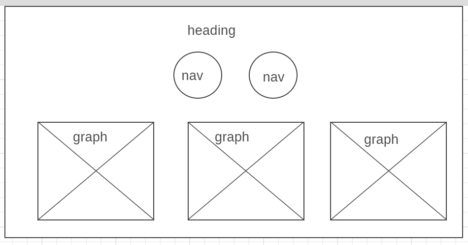
As part of the preparations for constructing this site the following wireframe was made:
Features
Existing Features
There is a reset button that allows the user to reset the dashboard to its original state. All graphs and charts are interactive and responsive. The total salary pie graphs allow the user to get a quick view of the total salary costs for the entire year. While the salary cost over time stacked bar chart allows the user to see how high the total cost is for each major type per month. The cost breakdown dashboard has a Select menu that allows the user to examine one specific type of pay. This is useful if say I’m curious about what account is used to bookkeep a specific pay type or want to see how the cost for a type fluctuate throughout the year.
Features Left to Implement
One feature that still needs to be implemented is that it would be great if the user could upload a file and see all the graphs for that file. That way comparisons between companies could be made. At the moment only one company can be evaluated.
Technologies Used
- HTML/CSS to write the code.
- Bootstrap to simplify the design process.
- Java Script for all scripts and data processing.
Testing
Testing have been done manually true out the project. All buttons and menus have been manually tested. The interactivity of the graphs has been tested manually. Some of the numbers in the charts have been picked at random and double checked against the CSV file to ensure that the data is displaying properly. Testing have insured that the site is responsive to all screen sizes in google dev tools. Two particularly interesting bugs where found throughout the project:
- The line in my line chart rendered as an awkward black area instead of as a line despite all the HTML and Java Script being correct. It turned out that the line had to be styled using CSS, fill:none property (see line 198 in style.css).
- The labels on the x-axis of the cost per type bar graph does not render centered in relationship to the bar when the graph is used dynamically (see the below picture). This was fixed by removing the .centerBar dc.js property from the graph.

Deployment
To deploy the project, I used GitHub Pages. I have used the master branch when deploying the project. There are no differences between the deployed version and the development version.
Credits
A special thanks to the code institute tutor team who have helped me immensely on this project.
Content
The data used in the CSV files that forms the basis of the charts have been taken from a real word company under the condition that the name of the company and any personal information was scrubbed from the files.
Media
- The background image used for the pages is taken from freepik.com.
- The background image used for the pages is taken from videoblocks.com
Acknowledgements
I was inspired to this project by my wonderful former colleagues at NCH Payroll


