See #39 if you have no idea what's CMSWrapper.
Overview
We can pass sidebarConfig and navbarConfig to <CMSWrapper /> to render sidebar and navbar easily.
<CMSWrapper
  sidebarConfig={SidebarConfig}
  navbarConfig={NavbarConfig}
  schema={schema}
>
  <CMS />
</CMSWrapper>
Details
There should be two components <Sidebar /> and <Navbar />, and then <CMSWrapper /> can just pass their config to them like below.
render() {
  const {sidebarConfig, navbarConfig, children} = this.props;
  return (<Layout>
    {...}
    <Navbar {...navbarConfig} />
    {...}
    <Sidebar {...sidebarConfig} />
    {...}
  </ Layout>)
}
<Sidebar />
Implement sidebar with antd Sider and Menu
sidebarConfig interface
interface MenuItemConfig = {
  title: string,
  pathname: string,
  params?: {
    operation?: 'create' | 'update',
    defaultPayload?: JSONString,
    filter?: JSONString
  }
}

interface SubmenuConfig = {
  title: string,
  items: Array<MenuItemConfig>
}

interface SidebarConfig = {
  menuConfig: Array<SubmenuConfig | MenuItemConfig>
}
<Sidebar /> will use menuConfig to generate the antd menu. When <MenuItem> is clicked, it should call the goTo method with argument {pathname, params}.
goTo is a method of RouterAdaptor
menuConfig examples
[{
  title: 'Posts',
  pathname: '/posts',
  params: {
    operation: 'create'
  }
  items: [...]
}]
current implement in CMS
render with schema
if sidebarConfig.menuConfig is passed as a true means user wants to render menu with schema, for examples:
import schema from 'canner.schema.js', we will actually get a object like below,
{
  connector: Connector,
  visitors: Vistors,
  schema: DataSchema
}
We can get the data schema and transform it to menu.
console.log(schema.schema);
/*
{
info: {type: 'object', title: 'My Info', keyName: 'info',...},
posts: {type: 'array', title: 'Posts', keyName: 'posts',...},
users: {type: 'array', title: 'Authors', keyName: 'authors',...}
}
*/
const menuConfig = transformSchemaToMenuConfig(schema.schema);
console.log(menuConfig);
/*
[{
title: 'My Info',
pathname: '/info'
}, {
title: 'Posts',
pathname: '/posts'
}, {
title: 'Authors',
pathname: '/authors'
}]
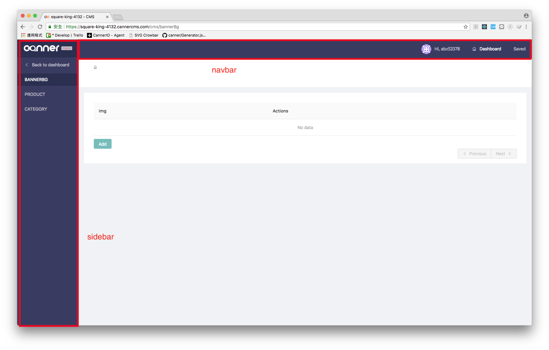
*/<Navbar />
important with antd Header and Menu
A navbar can be divided to three parts from left to right: logo, menu, save button:

And there are three properties correspond to the three parts on navbar.
navbarConfig interface
{
  logo: string, // img url
  renderMenu: () => React.Node,
  showSaveButton: boolean
}
ChangedData
Both Sidebar and Navbar should have different behavior when there are unsaved change:
- when user clicks another menu item, it should pop a confirm modal.
- the
saveButton on navbar should have dot badge.
See current implementation


 React
React
 Typescript
 Django
 Laravel
 Facebook
 Microsoft
 Google
 Alibaba
 D3
D3
 Tencent