react-native-text-field is a text field that wraps React Native TextInput with customizable field title and placeholder, masked text input, and text validation.
For the text validation, the react-native-text-field provides onValidate props to allow developers customize validation methods. Before version 3.0, react-native-text-field gives a general error to indicate the content in the text field is unexpected. However, for versions after 3.0, developers can provide multiple different error messages for various cases that could happen during the validation process.
For example, a Password field might need to be longer than 4 digits, and contains letters at the same time.
npm install react-native-masked-text
npm install react-native-text-field
import TextField from 'react-native-text-field';

render() {
  return (
    <TextField
      title="Header"
      placeholder="Placeholder"
      onInputChange={(text) => this.onInputChange(text)}
    />
  )
}

onInputChange(text) {
  console.log(text)
}
| Props | Description |
|---|---|
| title | Title of the text field. |
| placeholder | Placeholder of the text field. |
| onInputChange | Same function as onChangeText of React Native TextInput. Callback that is called when the text field has any text changes. Changed text is passed as a single string argument to the callback handler. |
render() {
	return(
		<TextField
			title="Password"
			placeholder="password"
			onInputChange={text =>
				this.onInputChange({ password: text })
			}
			onValidate={text => this.validatePassword(text)}
			invalidHint="Password is not valid."
			validateAsTyping={true}
			isSecured={true}
			isRequired={true}
			isRequiredHint="Password cannot be empty."
		/>
	)
}

validatePassword = (password) => {
	if (!password.length >= 4) {
		// Return error message as string if the text is not valid.
		return 'Password need to be at least 4 digits.'
	}
	if (!/[a-zA-Z]/.test(password)) {
		// Return a different error message if the text doesn't match certain criteria.
		return 'Password need to contain letters.'
	}

	return true // Return 'true' to indicate the text is valid.

}
| Props | Description |
|---|---|
| onValidate | Optional. Validation handler method that will be called when the text in the text field changes. Return true to indicate the text is valid. Return error message string to indicate the text doesn't match certain criteria. Return false to use the general error message, which is the value of invalidHint props. If this props is omitted, the validation won't be triggered. |
| invalidHint | Optional. General error message if the text validation fails. The default value of this props is 'Your input is not valid.' |
| validateAsTyping | Optional. If you need to validate the text content whenever the text changes, set this to true. By default, the validation will only be triggered when the user leaves the text field. |
| isSecured | Optional. Display text in the text field as *. The text field will have a switchable icon to change between visible and invisible. |
| isRequired | Optional. If a field is marked as required, the text field automatically check whether or not the content is empty, and display error message. The default value is false. |
| isRequiredHint | Optional. The error message string when a text field is marked as required, but the content is empty. By default, the message is 'Field is required.' |
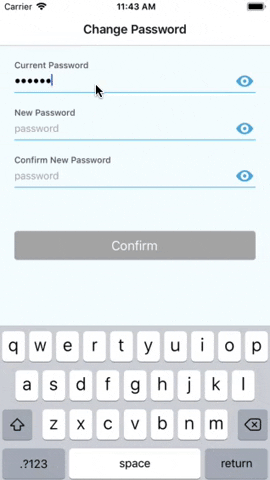
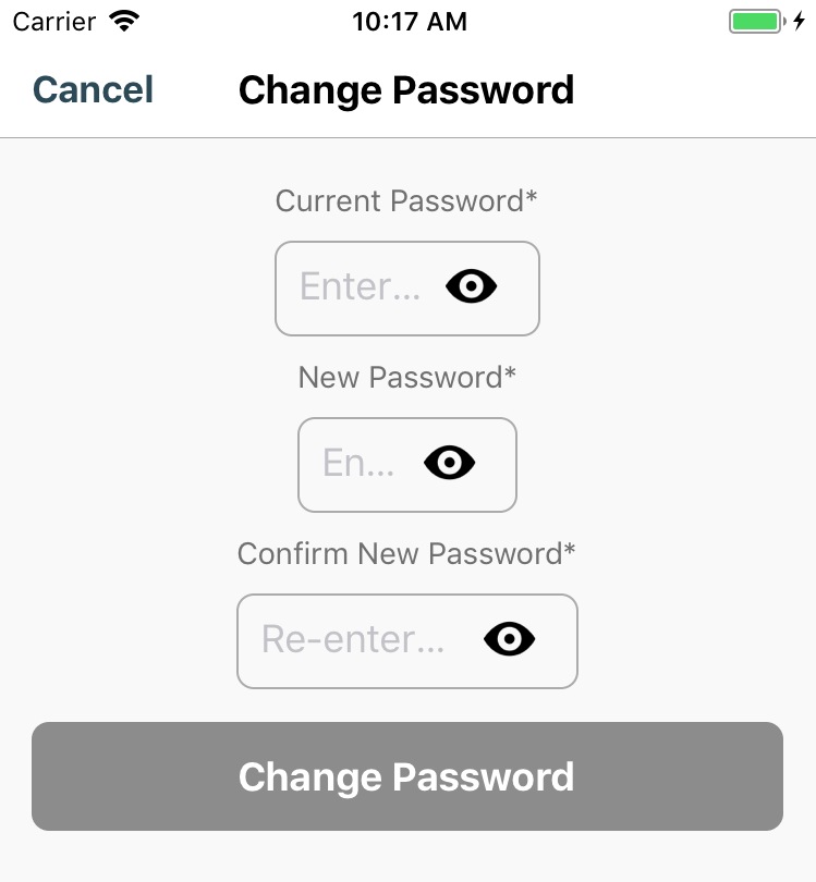
Samples of text fields that were made with react-native-text-field.

render() {
  return(
    <TextField
      title='Password'
      placeholder="password"
      onInputChange={(text) => this.onInputChange(text)}
      onValidate={(text) => this.validatePassword(text)}
      isSecured={true}
      cellHeight={40}
      isMultiline={false}
      width={300}
      selectionColor={'#5D95EF'}
      autoCapitalize={'none'}
      autoCorrect={false}
      style={{ marginTop: 20, marginBottom: 100 }}
      titleStyle={{ color: '#5D95EF' }}
      textFieldStyle={{ borderColor: '#BCC4D1' }}
      textInputStyle={{ color: '#000000' }
      placeholderStyle={{ color: '#BCC4D1' }}
      invalidTextFieldStyle={{ borderColor: '#EF6C40' }}
      invalidTextInputStyle={{ color: '#FF0000' }}
      invalidHintStyle=={{ fontSize: 10 }}
      visibilityIconTintColor={"#00ff00"}
	  visibilityIconSource={require('@Images/defaultIcon.png') }
	  invisibilityIconSource={require('@Images/defaultIcon.png') }
    />
   )
}
| Props | Description |
|---|---|
| cellHeight | Optional. Height of the text input. |
| width | Optional. Width of the text field. By default, the style props will determine how the text field looks like. When width is specifically assigned, the value of width take advantage of the 'width' in style. |
| autoCapitalize | Optional. 'none'/'sentences'/'words'/'characters'. The default value is 'none'. |
| autoCorrect | Optional. true/false. By default, the value is false. |
| selectorColor | Optional. Color of the selector in the text input. |
| style | Optional. Style of the whole text field container. |
| titleStyle | Optional. Style of the text field title. |
| textFieldStyle | Optional. Style of the text field. For example, making it as a round cornered box or a single underline slot. |
| textInputStyle | Optional. Style of the text in the text field. |
| placeholderStyle | Optional. Style of the placeholder. |
| invalidTextFieldStyle | Optional. Style of the text field when the validation fails. For example, highlight the text field border as red when there's error in the content of the text field. |
| invalidTextInputStyle | Optional. Style of invalid text style in the text field. By defaut, it's using the same value of textInputStyle |
| invalidHintStyle | Optional. Style of the error message which will be displayed under the text field if there are any errors. |
| visibilityIconTintColor | Optional. The tint color of the visible/invisible icon for secured text field. By default, tint color is null. |
| visibilityIconSource | Optional. Image source of the icon to indicate visiblity for secured text field. |
| invisibilityIconSource | Optional. Image source of the icon to indicate visiblity for secured text field. |
react-native-text-field integrated react-native-masked-textfor masked text, there for react-native-text-field supports almost all types of masks that react-native-masked-text provided. Check https://www.npmjs.com/package/react-native-masked-text for more details about how to defined your maskOptions object.
| Predefined Mask Type |
|---|
| 'cel-phone' |
| 'credit-card' |
| 'datetime' |
| 'money' |
| 'only-numbers' |
| 'zip-code' |
To use react-native-masked-text predefined masks, assign desired predefeind mask type to textType props. Each predefiend mask type has default maskOptions object, which can be overwritten via passing maskOptions props into the Text Field instance.
<TextField
	title='Payment Amount'
	placeholder="Payment Amount"
	onInputChange={(text) => this.onInputChange(text)}
	textType={'money'}
	maskOptions={{
	    unit: '€',
	    separator: '.',
	    delimiter: ','
	}}
/>
| Props | Description |
|---|---|
| textType | Optional. Type of predefined mask that include 'cel-phone', 'credit-card', 'datetime', 'money', 'only-numbers', 'zip-code', etc. |
| maskOptions | Optional. Each predefined type has default maskOptions object, which can be overwritten via passing maskOptions props into the Text Field instance. |
Besides using predefined masks, react-native-masked-text provide us the capability to customize masks. react-native-text-field support customizing masks as well.
To customize mask, assign 'custom' to props textType, and pass mask string into customMask props. Mask string is a string that contains '9', 'A', 'S' and '*', where '9' represents digit, 'A' represents alpha, 'S' represents alphanumeric, and '*' represents all except white space.
<TextField
	title='Customized Mask'
	placeholder="Customized Mask"
	onInputChange={(text) => this.onInputChange(text)}
	textType={'custom'}
	customMask={'(999)-999-9999'}
/>
In the example above, the text field is masking a phone number, for example,'7788550000' as '(778)-855-0000'.
In 2.x, the react-native-text-field is validating the text field content as per typing. In 3.x, validateAsTyping props were added with default value false. If you need to keep validating your text field whenever the text changes, please manually assign validateAsTyping to true. Otherwise, the validation will be executed once only when user leaves the text field.
If you are using width props of react-native-text-field, you might be just well without changing anything since the width takes higher priority than width in style props. If you notice that your horizontal margin looks not correct, please use marginLeft and marginRight in style props to adjust the margin to the left and right edge of the screen.


 React
React
 Typescript
 Django
 Laravel
 Facebook
 Microsoft
 Google
 Alibaba
 D3
D3
 Tencent