Light-weight autocomplete component for Angular (2/4+).

https://github.com/sengirab/ngAutocomplete
npm i ng-auto-complete --save
First thing to note, i've created this package to be as simple as possible. That's why i don't include any styling, this is so you could style it the way you want it.
If you like the styling i did for the example .gif shown above, you can copy it from here.
- .ng-autocomplete-dropdown
- .ng-autocomplete-inputs
- .ng-autocomplete-input
- .ng-autocomplete-placeholder
- .ng-autocomplete-dropdown-icon (.open)
- .ng-dropdown (.open)
- .dropdown-item
"{group: AutocompleteGroup, item: AutocompleteItem}""{group: AutocompleteGroup, item: null}"Note that when calling completer.ResetInput('completer'), this will clear the input. This means that the
completer will emit {group: AutocompleteGroup, item: null}. If your listening to this within your component
keep in mind that each clear the item will be null
The input will also emit "null" when the input reaches a length of <= 0.
import {BrowserModule} from "@angular/platform-browser";
import {NgModule} from "@angular/core";
import {FormsModule} from "@angular/forms";
import {HttpModule} from "@angular/http";

import {AppComponent} from "./app.component";
import {NgAutoCompleteModule} from "ng-auto-complete";

@NgModule({
    declarations: [
        AppComponent
    ],
    imports: [
        BrowserModule,
        FormsModule,
        HttpModule,
        NgAutoCompleteModule
    ],
    providers: [],
    bootstrap: [AppComponent]
})
export class AppModule {
}import {Component, ViewChild} from "@angular/core";
import {CreateNewAutocompleteGroup, SelectedAutocompleteItem, NgAutocompleteComponent} from "ng-auto-complete";
@Component({
selector: 'app-root',
templateUrl: './app.component.html',
})
export class AppComponent {
@ViewChild(NgAutocompleteComponent) public completer: NgAutocompleteComponent;
public group = [
CreateNewAutocompleteGroup(
'Search / choose in / from list',
'completer',
[
{title: 'Option 1', id: '1'},
{title: 'Option 2', id: '2'},
{title: 'Option 3', id: '3'},
{title: 'Option 4', id: '4'},
{title: 'Option 5', id: '5'},
],
{titleKey: 'title', childrenKey: null}
),
];
constructor() {
}
/**
*
* @param item
* @constructor
*/
Selected(item: SelectedAutocompleteItem) {
console.log(item);
}
}<ng-autocomplete (selected)="Selected($event)" [classes]="['']" [group]="group"></ng-autocomplete>public selected: any[] = [];
Selected(item: SelectedAutocompleteItem) {
this.selected.push(item.item);
/**
* Remove selected values from list,
* selected value must be of type: {id: string(based on GUID's), [value: string]: any}[]
*/
this.completer.RemovableValues('completer', this.selected)
}In some cases you may want to disable auto completion. e.g you want a html select element.
public group = [
    CreateNewAutocompleteGroup(
        'Search / choose in / from list',
        'completer',
        [
            {title: 'Option 1', id: '1'},
            {title: 'Option 2', id: '2'},
            {title: 'Option 3', id: '3'},
            {title: 'Option 4', id: '4'},
            {title: 'Option 5', id: '5'},
        ],
        {titleKey: 'title', childrenKey: null},
        '',
        false
    )
];public group = [
CreateNewAutocompleteGroup(
'Search / choose in / from list',
'completer_one',
[
{
title: 'Option 1', id: '1',
children: [
{title: 'Option 1', id: '1'},
{title: 'Option 2', id: '2'}
]
},
{
title: 'Option 2', id: '2',
children: [
{title: 'Option 3', id: '3'},
{title: 'Option 4', id: '4'}
]
},
{
title: 'Option 3', id: '3',
children: [
{title: 'Option 5', id: '5'},
{title: 'Option 6', id: '6'}
]
},
],
{titleKey: 'title', childrenKey: 'children'},
''
),
CreateNewAutocompleteGroup(
'Search / choose in / from list',
'completer_two',
[
{title: 'Option 1', id: '1'},
{title: 'Option 2', id: '2'},
{title: 'Option 3', id: '3'},
{title: 'Option 4', id: '4'},
{title: 'Option 5', id: '5'},
{title: 'Option 6', id: '6'},
],
{titleKey: 'title', childrenKey: null},
'completer_one'
)
];import {Component, OnInit, ViewChild} from "@angular/core";
import {FormArray, FormBuilder, FormGroup} from "@angular/forms";
import {CreateNewAutocompleteGroup, SelectedAutocompleteItem, NgAutocompleteComponent} from "ng-auto-complete";
@Component({
selector: 'app-root',
templateUrl: './app.component.html',
})
export class AppComponent implements OnInit {
@ViewChild(NgAutocompleteComponent) public completer: NgAutocompleteComponent;
public form: FormGroup;
public group = [
CreateNewAutocompleteGroup(
'Search / choose in / from list',
'completer',
[
{title: 'Option 1', id: '1'},
{title: 'Option 2', id: '2'},
{title: 'Option 3', id: '3'},
{title: 'Option 4', id: '4'},
{title: 'Option 5', id: '5'},
],
{titleKey: 'title', childrenKey: null}
),
];
constructor(private _fb: FormBuilder) {
}
/**
*
*/
ngOnInit() {
this.form = this._fb.group({
items: new FormArray([])
});
}
/**
*
* @param item
* @constructor
*/
Selected(item: SelectedAutocompleteItem) {
this.form.controls['items'] = this._fb.array([...this.form.controls['items'].value, item.original]);
console.log(item);
}
}- Big performance refactor.
- Instead of using arrays, now uses objects. Search by object key.
- New @output, (no-results) emits GroupNoResult.
- A lot of internal changes & bugfixes.
- In some cases when the a view has a hidden ng-content, that shows if an expression evaluates to true and
a completer function has been used e.g(
SelectItem('completer', 5)) it would give an error; completer view is not initialized.- Functions that are called before the completer view has been initialized are now queued to be fired when the view is actually initialized.
- Added tab to submit events. (not preventing default, so still goes to the next input, if there's one).
- Added better support for navigating with arrows. Dropdown list now navigates to the selected item if the items exceed the dropdown its given height.
- Internal code cleanup.
- Mobile update: Remove mouseover when mobile. This prevents the user from needing to double tap the options.
- Some internal styling has changed.
- When completer is turned of, input used to be disabled. This doesn't work on all browsers. Input now get
pointer-events: none;
- When completer is turned of, input used to be disabled. This doesn't work on all browsers. Input now get
- Browser compatibility.
- Value has to be set on input (equal to ngModel).
- This created an issue on safari, when an item was selected, the placeholder didn't go away.
- There's a new element
span.ng-autocomplete-dropdown-iconthis replaces the dropdown icon i did with css only.
- Increase of internal performance.
- Had some issues with Element refs. #fixed.
-
It's now possible to instantiate CreateNewAutocompleteGroup with an empty array and set its value later. This can be useful when you're waiting for an async task to complete.
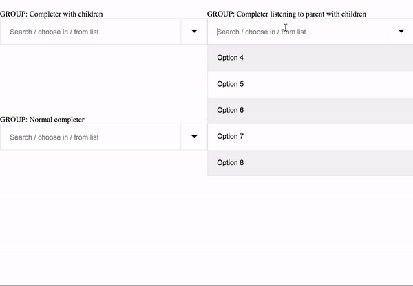
const component = NgAutocompleteComponent.FindCompleter('completer', this.completers); component.SetValues( 'late', // <-- NOTE: this is the key of the input. You can call this what you want. [ {title: 'Option 4', id: '1'}, {title: 'Option 5', id: '2'}, {title: 'Option 6', id: '3'}, {title: 'Option 7', id: '4'}, {title: 'Option 8', id: '5'}, {title: 'Option 9', id: '6'}, ] ) -
Created new pipe to highlight search query. class
dropdown-item-highlight
- CreateNewAutocompleteGroup now accepts {id:string|number}, before only {id:string}
- Some small changes.
- KeyEvents now preventDefault
- Close dropdown on tab.
- Open dropdown on focus - was only on click.
- Updated README.md.
- Maintain active option when input is blurred - also for disabled completion inputs now.
- Updated README.md.
- Maintain active option when input is blurred.
- Updated README.md.
- Updated README.md.
- Fixed an issue; when selecting a option from a completer that is parent, active child option didn't reset.
- Updated README.md.
-
SelectItem(key: string, id: string)
- NgAutocompleteComponent function - Set value manual, by id. This can be useful when the list is loaded but there's a value set in the database. When the data is fetched from server, this method can be used.
  @ViewChild(NgAutocompleteComponent) public completer: NgAutocompleteComponent;
  this.completer.SelectItem('completer', '1');
  @ViewChildren(NgAutocompleteComponent) public completers: QueryList<NgAutocompleteComponent>;

  const completer = NgAutocompleteComponent.FindCompleter('group1', this.completers);
  completer.SelectItem('completer', '1');
- Only groups with parents did a reset when the input reached a length <= 0. Now all inputs do, input with parents still get set to initial value.
- ResetCompleters to ResetInputs.
- ResetCompleter to ResetInput.
- FindCompleter to FindInput.
- TriggerChangeCompleters to TriggerChange.
- <ng-autocomplete [key]="'group1'"> - Added key on component.
- static FindCompleter usage (NgAutocompleteComponent.FindCompleter()) (not to be confused with the old FindCompleter, now FindInput)
- (key: string, list: QueryList): NgAutocompleteComponent. This can be useful when you have multiple ng-autocomplete components in one component. Note that this can only be used when the view has been init.
I have made all NgAutocompleteComponent and CompleterComponent functions public, so you could do a lot more than i'll show you
I've documented the functions of which i think their useful:
@ViewChild(NgAutocompleteComponent) public completer: NgAutocompleteComponent;| Function | Description |
|---|---|
| FindCompleter((key: string, list: QueryList)) (Static function) | Finds completer |
| ResetInputs() | Resets all rendered completer inputs |
| FindInput(key: string) | Find completer input by assigned key |
| RemovableValues(key: string, list: {id: string or number, [value: string]: any}[]) | Remove options from rendered list (by id) |
| SelectItem(key: string, id: string or number) | e.g set an initial value on the completers input |
| SetValues(key: string, {id: string or number, [value: string]: any}[]) | Sets values for the input. Useful in async situations. |
@ViewChild(NgAutocompleteComponent) public completer: NgAutocompleteComponent;
public input = this.completer.FindInput('completer');| Function | Description |
|---|---|
| ClearValue() | Clears found completer's input. |
- Fork & clone
- npm install
- ng serve
- git checkout -b my-new-feature
- component lives in src/app/ng-autocomplete/*
- Submit a pull request
- Link to duplicate issues, and suggest new issue labels, to keep things organized
- Go through open issues and suggest closing old ones.
- Ask clarifying questions on recently opened issues to move the discussion forward


 React
React
 Typescript
 Django
 Laravel
 Facebook
 Microsoft
 Google
 Alibaba
 D3
D3
 Tencent