
A curated list of awesome themes and plugins for Obsidian.
| Name | Description | Credits |
|---|---|---|
| Markdownload | A Firefox and Google Chrome extension to clip websites and download them into a readable markdown file. | deathau |
| Copy Selection as Markdown | Firefox add-on to copy a selection or link as formatted Markdown | 0x6b |
| Notion to Obsidian converter | Simple script to convert exported Notion notes to Obsidian | connertennery |
| Yarle - Yet Another Rope Ladder from Evernote | Node.js app to convert exported Evernote notes to Markdown (Obsidian) | akosbalasko |
| Obsidian to HTML converter | Python script that converts an Obsidian vault into HTML files. Useful for publishing a vault as a static website. | kmaasrud |
Most themes should be available through the Community Themes pane in Obsidian's settings. If not, enable Custom CSS under Plugins, download obsidian.css from the desired repository and place it in the vault root.
| Name | Description | Image | Credits |
|---|---|---|---|
| Dracula | A dark theme for Obsidian. |  |
jarodise |
| 80s Neon | A retro-future 80s inspired theme for Obsidian. |  |
deathau |
| Base2Tone | A theme for Obsidian based on http://base2t.one/ with default hues from http://simurai.com/duotone-dark-sky-syntax/. |  |
deathau |
| Clean theme | A minimal and clean theme designed to be clutter-free and easy on the eye. |  |
kmaasrud |
| OneDark Theme | This theme is based on One Dark Pro and One Dark Pro is based on Atom's default One Dark theme. Currently only supports Dark mode. |  |
pionxzh |
| Comfort Color Dark Theme | A dark theme for Obsidian. | 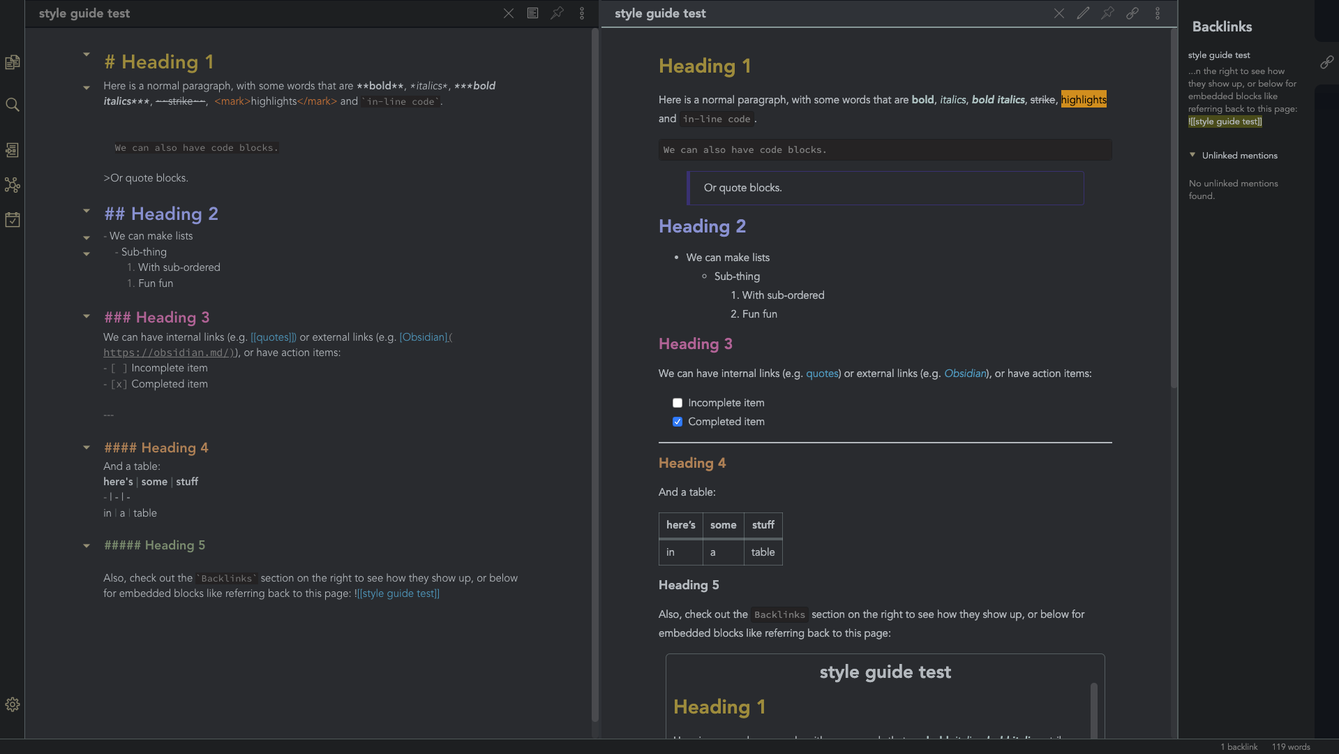 |
obsidian-ezs |
| Gruvbox Theme | This is a gruvbox theme for Obsidian. It supports both light and dark modes. |  |
insanum |
| Gastown | A light theme for Obsidian. |  |
dogwaddle |
| Ursa | A light and dark theme for Obsidian featuring "zen mode" with collapsing side panels and improved single pane viewing. | 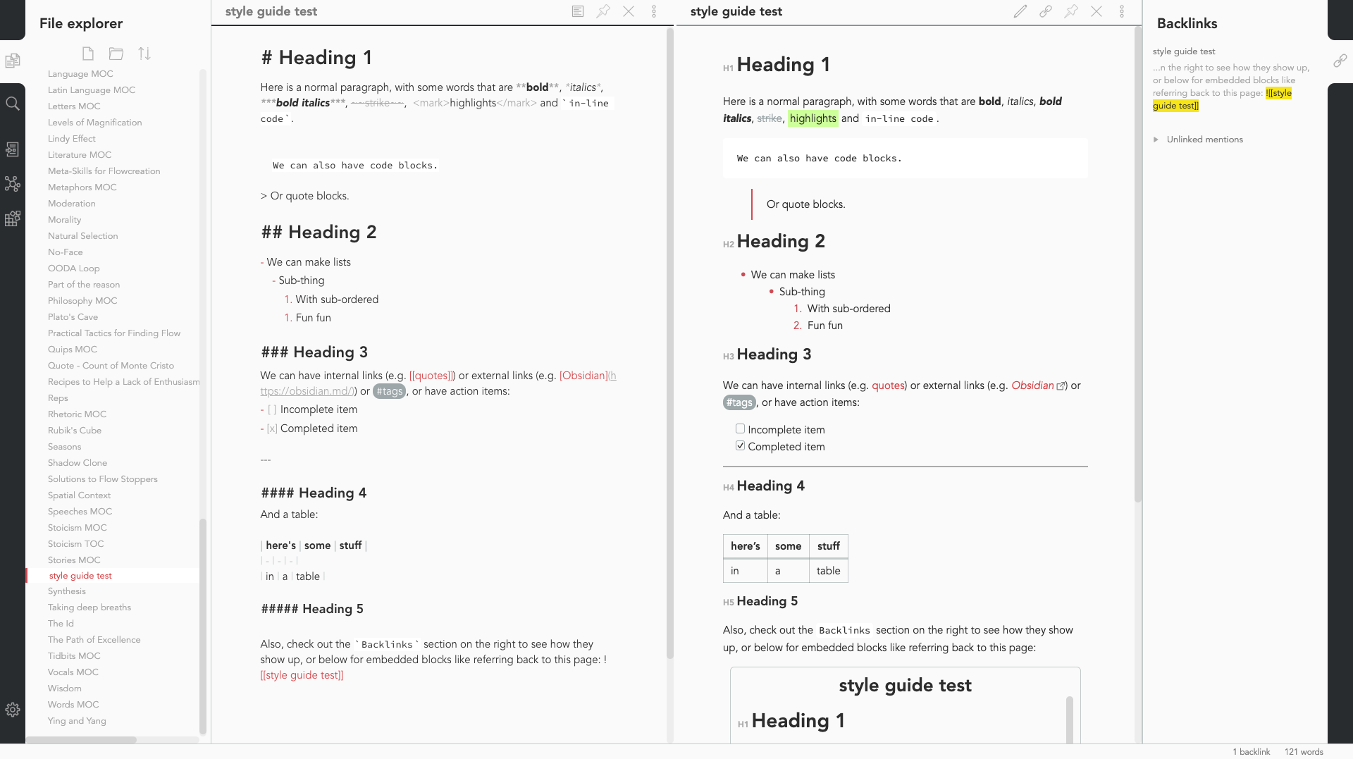 |
obsidian-ezs |
| Obsidian Solarized | This is just a recolor based on the solarized color scheme. |  |
Slowbad |
| Red Graphite | A light theme for Obsidian, based on Bear.app's Red Graphite theme. |  |
seanwcom |
| Obsidian + Nord | A Nord-based theme for Obsidian, only supporting dark mode |  |
insanum |
Small tweaks to add to your obsidian.css file
CSS
/* everything under .mod-root now. Don't want Andy messing with sidebars */
/* also, Andy only makes sense for vertical splits, at the root level, right? */
.mod-root.workspace-split.mod-vertical {
  overflow-x:auto;
  --header-width: 36px; /* <- 36px is the header height in the default theme */
}
.mod-root.workspace-split.mod-vertical > div {
  min-width: calc(700px + var(--header-width)); /* <-- 700px is the default theme's "readable" max-width */
  box-shadow: 0px 0px 20px 20px rgba(0,0,0,0.25);
  position:sticky;
  left:0;
}
/* shift sticky position, so titles will stack up to the left /
/ This will currently stack to a maximum of 10 before resetting */
.mod-root.workspace-split.mod-vertical > div:nth-child(10n-8) { left: calc(var(--header-width) * 0); }
.mod-root.workspace-split.mod-vertical > div:nth-child(10n-7) { left: calc(var(--header-width) * 1); }
.mod-root.workspace-split.mod-vertical > div:nth-child(10n-6) { left: calc(var(--header-width) * 2); }
.mod-root.workspace-split.mod-vertical > div:nth-child(10n-5) { left: calc(var(--header-width) * 3); }
.mod-root.workspace-split.mod-vertical > div:nth-child(10n-4) { left: calc(var(--header-width) * 4); }
.mod-root.workspace-split.mod-vertical > div:nth-child(10n-3) { left: calc(var(--header-width) * 5); }
.mod-root.workspace-split.mod-vertical > div:nth-child(10n-2) { left: calc(var(--header-width) * 6); }
.mod-root.workspace-split.mod-vertical > div:nth-child(10n-1) { left: calc(var(--header-width) * 7); }
.mod-root.workspace-split.mod-vertical > div:nth-child(10n+0) { left: calc(var(--header-width) * 8); }
.mod-root.workspace-split.mod-vertical > div:nth-child(10n+1) { left: calc(var(--header-width) * 9); }
/* now it's time for the fancy vertical titles */
/* first we'll add a bit of gap for the title to sit inside of */
.workspace-leaf-content {
padding-left: var(--header-width);
position: relative;
}
/* this is where the magic happens */
.view-header {
writing-mode: vertical-lr;
border-right: 1px solid var(--background-secondary-alt);
border-left: 2px solid var(--background-secondary-alt);
border-top: none;
border-bottom: none;
height: auto;
width: var(--header-width);
position: absolute;
left:0;
top:0;
bottom:0;
}
/* active titles have different border colours */
.workspace-leaf.mod-active .view-header {
border-right: 2px solid var(--interactive-accent);
border-bottom: none;
}
/* unset the title container height and swap padding */
.view-header-title-container {
height: unset;
padding-left: unset;
padding-top: 5px;
}
/* fix the long-title-obscuring shadows */
.view-header-title-container:after {
width: 100%;
height: 30px;
top:unset;
bottom: 0;
background: linear-gradient(to bottom, transparent, var(--background-secondary));
}
.workspace-leaf.mod-active .view-header-title-container:after {
background: linear-gradient(to bottom, transparent, var(--background-primary-alt));
}
/* swap the padding/margin around for the header and actions icons */
.view-header-icon, .view-actions {
padding: 10px 5px;
}
.view-action {
margin: 8px 0;
}
/* get rid of the gap left by the now-missing horizontal title */
.view-content {
height: 100%;
}
/* make the fake drop target overlay have a background so you can see it. /
/ TODO: figure out how the fake target overlay works so we can put the title back, too */
.workspace-fake-target-overlay {
background-color: var(--background-primary);
}
Credits to deathau
CSS
.side-dock-ribbon.mod-left.is-collapsed:not(:hover), .side-dock-ribbon.mod-right.is-collapsed:not(:hover) {
  width: 15px !important;
  opacity: 0;
}
.side-dock-ribbon {
  transition-property: width, opacity;
}
Credits to kmaasrud
CSS
.cm-hmd-list-indent .cm-tab, ul ul { position: relative; }
.cm-hmd-list-indent .cm-tab::before, ul ul::before {
 content:'';
 border-left: 1px solid rgba(0, 122, 255, 0.25);
 position: absolute;
}
.cm-hmd-list-indent .cm-tab::before { left: 0; top: -5px; bottom: -4px;
}
ul ul::before { left: -11px; top: 0; bottom: 0;
}
Credits to deathau
Auto-fading note controls
.view-header:not(:hover) .view-actions {
  opacity: 0.1;
  transition: opacity .25s ease-in-out;
}
Auto-fading status bar
.status-bar:not(:hover) .status-bar-item {
  opacity: 0.25;
  transition: opacity .25s ease-in-out;
}
Credits to Rumen Dimitrov


 React
React
 Typescript
 Django
 Laravel
 Facebook
 Microsoft
 Google
 Alibaba
 D3
D3
 Tencent