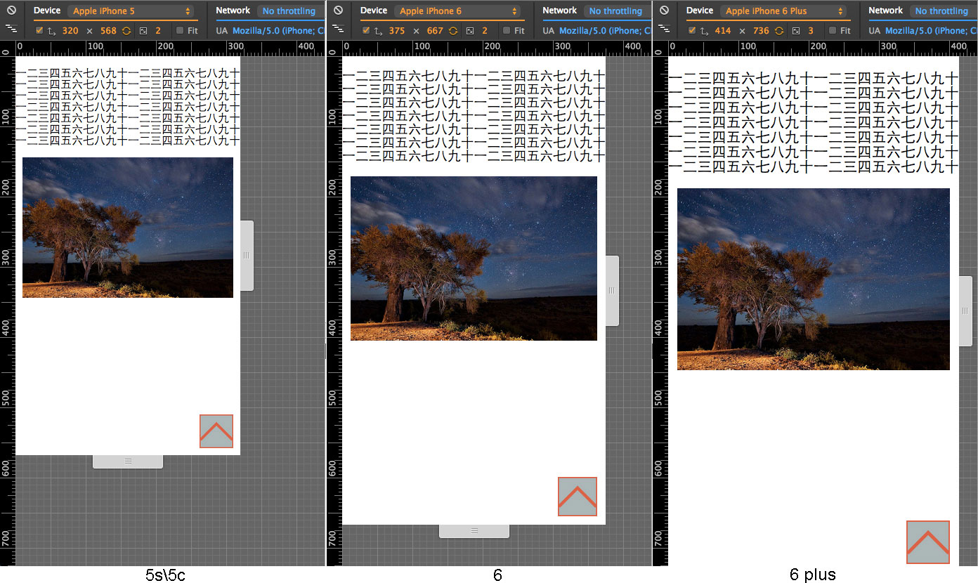
使用rem布局,屏幕越大,对应的“字体、图片、交互按钮”的大小也越大,同时大小能在用户旋转设备方向,或调整窗口大小(桌面端)时自动调整,如图:
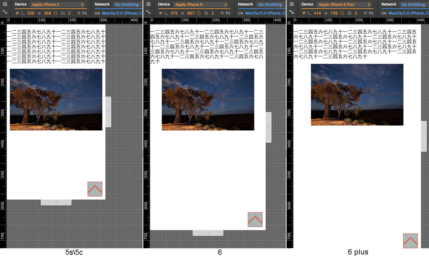
使用经典的px并结合弹性盒布局,在更大的屏幕上将展示更多的内容,同时,图片(此处没有使用弹性盒)、交互按钮也相对屏幕较小。如图:
在下列情况下,这种“rem响应式”布局会效果更好:
- 页面可交互元素(可点击的图片、按钮、链接等)较多——此时如果按照“固定像素布局”,dpi过高的屏幕,每个css像素所对应的物理长度毫米数较小,那么可交互元素就会特别小,不易操作。大家可以拿魅族MX3感受一下
- 页面需要考虑年龄较大、视力一般的用户——他们买大屏手机就是为了字体更大好不好?
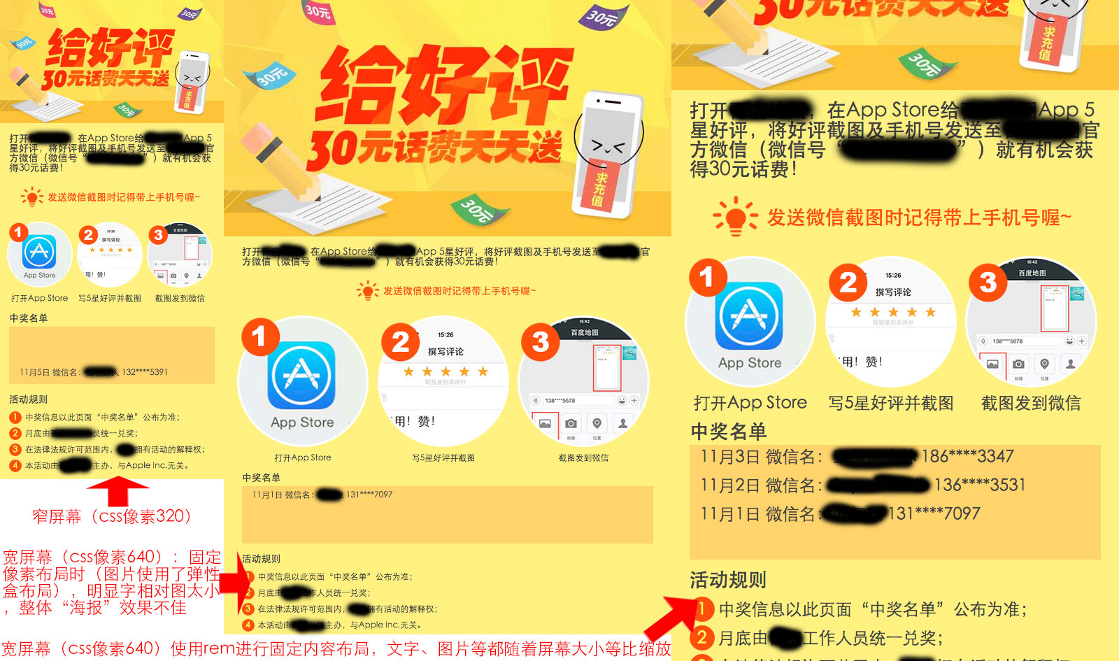
- 页面是海报、广告、产品(或新功能)介绍性质,希望保持图片、文字相对屏幕的比例——在“固定像素布局”布局中,图片我们当然可以通过百分比或弹性盒布局来自适应变大,可是处理文字的字体大小不太方便,可能会导致像这样:
“固定内容布局”的布局在开发时还会带来一些便利,如:
- 无需理解“弹性盒”,即可开发自适应的移动端页面
- 可直接按照设计师给的PSD文件1:1开发,无需考虑自适应问题
相对直接设置 viewport meta 为一个定值,如 width=320 有什么不一样?
这样设置的确不用再处理rem,即可按照320px css像素的布局来渲染页面,而不用考虑设备的实际css像素宽度是多少,但是这种方案的缺点也比较明显
- 失去了一些便捷性,所有的元素或间距都会按照屏幕宽度的变化而发生大小的变化。如果使用rem的方式来布局,希望按照屏幕宽度的变化而发生大小的变化的,则使用rem作为单位;不需要的,则还是可以使用先前经典的px作为单位,和结合弹性盒模型来布局
- 过小的定值无效。设备将按照自己在
width=device-width状态下的css像素和这个定值中的 较大值 来设置视窗的css像素宽度,使得过小的定值无效。如在iPhone 6上,设置定值320,而它在width=device-width状态下的css像素为375,375>320,则还是会按照375来设置视窗的css像素宽度 - 使用定值可能会引起其他的问题。 例
- 设置移动端网页专用的viewport meta,至少需要包含
width=device-width,initial-scale=1.0,如<meta name="viewport" content="width=device-width,initial-scale=1.0,maximum-scale=1.0,minimum-scale=1.0,user-scalable=no" /> - 在
head内,任何外链的css或js文件之前,新建一个script标签,将build/rem.js粘贴进去。 - 设定参数,设定代码中最后3行的三个参数(通常情况下你不需要更改它们)。请注意参数的单位都是css像素(参照像素),而非实际的物理像素
- 开始你的开发,按照设计图开发样式,但是长度单位需要通过除以html元素的font-size来换算。如:一个按钮的高度是20px(css像素),参数设定的html的font-size为16,则它的样式需要写成
height:1.25rem
All code licensed under the MIT License . In other words you are basically free to do whatever you want. Just don’t remove my name from the source.
夕阳树的照片、海报示例页面截图 来源网络。
 React
React
 Typescript
 Django
 Laravel
 Facebook
 Microsoft
 Google
 Alibaba
 D3
D3
 Tencent