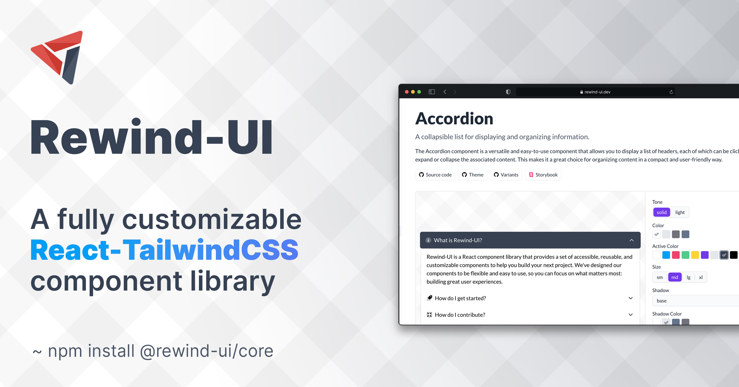
Built specifically for use with React and Tailwind CSS, Rewind-UI offers a range of accessible, highly customizable components that can be easily integrated into any react project. Rewind-UI comes with a set of default styles that can be easily customized using Tailwind CSS classes. Furthermore, each component can be parameterized using a set of props that can be used to change the default styles of the component.
Rewind-UI is available as an NPM package and can be installed using the following command:
npm install @rewind-ui/coreRewind-UI is designed to be used with React and Tailwind CSS. To use Rewind-UI, you must first install ReactJS and Tailwind CSS in your project. Furthermore, you must also install the following NPM packages:
npm install tailwind-scrollbar @tailwindcss/forms @tailwindcss/typographyAfter having installed Tailwind CSS, you must configure it to work with Rewind-UI. To do this, you must first create a tailwind.config.js file in the root directory of your project. Then, add the following code to that config file:
It is highly recommended to add only the needed style files to avoid having a bloated css file
module.exports = {
  content: [
    './src/**/*.{html,jsx,tsx}',
    // you can either add all styles
    './node_modules/@rewind-ui/core/dist/theme/styles/*.js',
    // OR you can add only the styles you need
    './node_modules/@rewind-ui/core/dist/theme/styles/Button.styles.js',
    './node_modules/@rewind-ui/core/dist/theme/styles/Text.styles.js'
  ],
  plugins: [
    require('@tailwindcss/typography'),
    require('tailwind-scrollbar')({ nocompatible: true }),
    require('@tailwindcss/forms')({
      strategy: 'class' // only generate classes
    })
  ]
};To start using Rewind-UI components just add the following import statement to the top of your React component:
import { Button } from '@rewind-ui/core';Then, you can use the component in your JSX code:
<Button>Click Me</Button>Each component has a set of default styles that can be parameterized using the corresponding props. For example, the Button component has a default blue color and a medium size. These values can be changed by setting the color and size props to the component:
<Button color="black" size="sm">Click Me</Button>Moreover, the style of a component can be customized by passing the normal className prop to it. This prop can be used to override the default styles of the component. For example, the following code will change the font weight of the button to semi-bold:
Rewind-UI is using tailwind-merge to merge the default classes with the classes you provide in the className prop and resolve any possible conflicts.
<Button color="black" size="sm" className="font-semibold">Click Me</Button>Trying to avoid to make the user use multiple properties again and again we have created a variant prop. A variant is basically a pre-defined set of properties that can be used to customize a component. For example, the Button component has a success variant that can be used to create a bootstrap-like success button:
<Button variant="success">Click Me</Button>You can read more about the variants of each component in their corresponding documentation page.
All Rewind-UI components are highly customizable. This means that you can easily change the default styles of a component by overriding the corresponding Tailwind CSS classes. You can read more about style customization on the theming page.
Special thanks to the following people:
- Joe Bell - For his amazing open source library Class Variance Authority which is the foundation of rewind's theming system.
- Jack Herrington - For inspiring me to start building Rewind-UI.
- shadcn - For his open source projects (taxonomy & ui) that helped me build this documentation.
Special thanks to the following teams:
- React - For creating React.
- Tailwind Labs - For creating Tailwind CSS.
- Vercel - For creating Next.js and their awesome open source templates.
- Floating-UI - For creating Floating-UI.
- Phosphor - For creating Phosphor icon family.


