Comments (89)
 ZekeZDev
commented on May 29, 2024
10
ZekeZDev
commented on May 29, 2024
10

What do you guys think of this?
from polymc.
 karolinaabb
commented on May 29, 2024
7
karolinaabb
commented on May 29, 2024
7
Hi, I've made this pixel logo from scratch. I'm open to feedback! Let me know if there's anything worth tweaking.

from polymc.
ZekeZDev
commented on May 29, 2024
2


Here's what it looks like without modifications removing the logo
from polymc.
ZekeZDev
commented on May 29, 2024
2

heres a concept I dont really like it and I think it needs a lot of work
from polymc.
 iSeth500
commented on May 29, 2024
2
iSeth500
commented on May 29, 2024
2

Looking better all the time!
from polymc.
iSeth500
commented on May 29, 2024
2
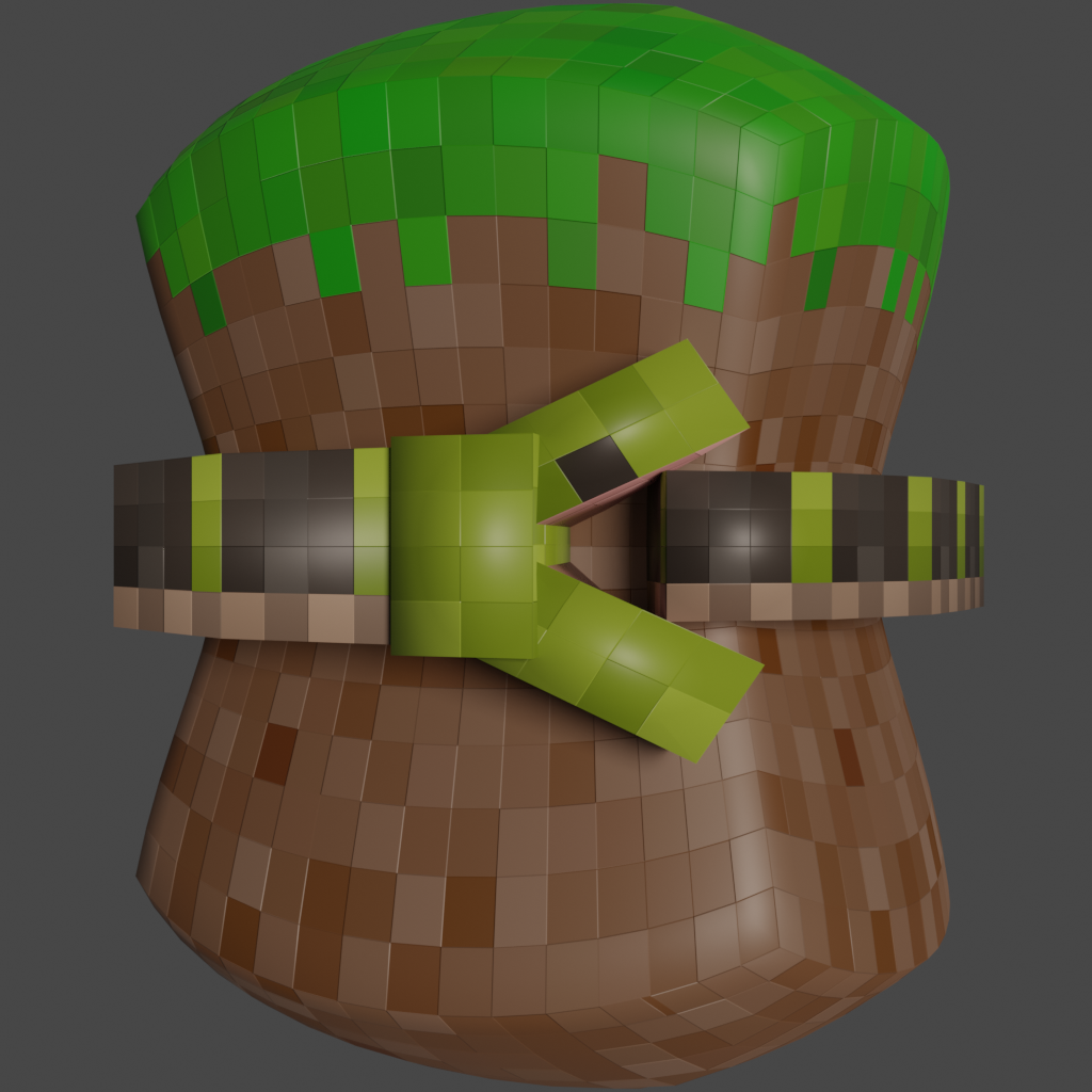
Last version I put here, probably.
Came to my senses with the whole realistic snake thing lol
from polymc.
iSeth500
commented on May 29, 2024
2
loading.mp4
from polymc.
ZekeZDev
commented on May 29, 2024
1
Here's a quick concept I made. Obviously not final but this is the sort of design I am leaning to that I think would stand out but be familiar.
from polymc.
ZekeZDev
commented on May 29, 2024
1

New design with grass looking like grass and gradient fixes
from polymc.
ZekeZDev
commented on May 29, 2024
1

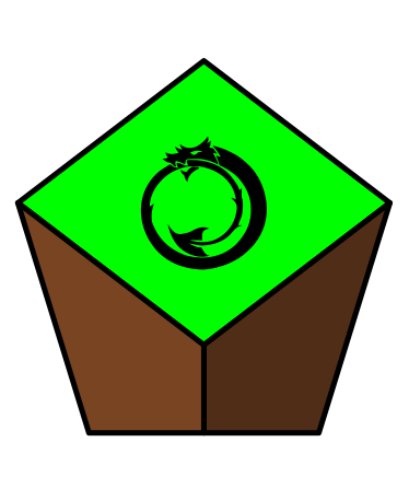
heres with ouroboros if we want to stick with ouroboros I will change the drop shadow a bit
from polymc.
ZekeZDev
commented on May 29, 2024
1
@konradmb Im doing a vote in the discussion channel on matrix to see if we keep the snake
from polymc.
The name PolyMC is already used by https://github.com/TheEpicBlock/PolyMc
from polymc.
 binex-dsk
commented on May 29, 2024
binex-dsk
commented on May 29, 2024
The name PolyMC is already used by https://github.com/TheEpicBlock/PolyMc
I've asked that project's maintainer if it's alright for us to use the name (probably is because it's LGPL). If he says yes we'll keep it unless someone suggests a better name
from polymc.
binex-dsk
commented on May 29, 2024
@LiamMCW The maintainer of that project said it's alright for us to use it. Thank you for letting me know though!
from polymc.
 TheFrenchGhosty
commented on May 29, 2024
TheFrenchGhosty
commented on May 29, 2024
@binex-dsk Some random ideas:
ManyMC
UnitedMC
MuchMC (you can even use doge as a mascot with this one 👀 )
PS: thanks for this fork, I'm really looking forward to have a MultiMC that isn't ruined by the developer's ego, (I'm waiting for a .deb/a debian repo and an AUR package - I'm currently on GDLauncher... but it's not great).
from polymc.
binex-dsk
commented on May 29, 2024
Thanks for the ideas and you're welcome! I've got no clue how to make a debian repo, let alone a .deb, but later during break (probably after Christmas) I'll work on that, along with a Gentoo ebuild. @LennyMcLennington can make the AUR package, and it and the ebuild should be easy because we've already got our own MultiMC packages, so we just need to change the repo.
from polymc.
TheFrenchGhosty
commented on May 29, 2024
@binex-dsk I mean it's not ideal... but what about an AppImage?
from polymc.
binex-dsk
commented on May 29, 2024
@binex-dsk I mean it's not ideal... but what about an AppImage?
Not sure how to make those either. I can work on that later as well.
from polymc.
binex-dsk
commented on May 29, 2024
We're gonna stick with PolyMC because I've already done a lot of work using this name, like buying a domain (polymc.org).
We now just need to settle on the final logo
from polymc.
binex-dsk
commented on May 29, 2024
yemou on Discord whipped up a quick logo for us. It doesn't use Ouroboros as a base but if anyone would like to do that it would be greatly appreciated.
from polymc.
binex-dsk
commented on May 29, 2024
new version by lovetocode999
He also is working on vectorizing Ouroboros and making a version based off of that so we'll probably end up using that as our final logo. This will be the temporary logo for now
from polymc.
binex-dsk
commented on May 29, 2024
cool ouroboros vector by lenny

will use this for now, if anyone wants to make a cool version with a minecraft background or something that would be nice
from polymc.
 d-513
commented on May 29, 2024
d-513
commented on May 29, 2024
IMO a flat, minecrafty logo would fit the launcher well. Flat ouroboros with maybe some Minecraft block as background would fit well
from polymc.
 yemouu
commented on May 29, 2024
yemouu
commented on May 29, 2024
The yellow circle makes me a think a gold block might look good there
from polymc.
binex-dsk
commented on May 29, 2024
That's a good idea. Gold block SVG laid behind the Ouroboros would be very nice if anyone's willing.
from polymc.
d-513
commented on May 29, 2024
@karolinabb Hi, I've made this pixel logo from scratch. I'm open to feedback! Let me know if there's anything worth tweaking.
Love it. Can you upload SVG version?
from polymc.
karolinaabb
commented on May 29, 2024
The original is made in LibreSprite (raster) which then I converted to svg by Pixels to svg
Here are the files: https://github.com/karolinaabb/PolyMC-logo
from polymc.
d-513
commented on May 29, 2024
The original is made in LibreSprite (raster) which then I converted to svg by Pixels to svg Here are the files: https://github.com/karolinaabb/PolyMC-logo
I would think such a converter would lose quality, but it looks like the svg is properly made and small size (3KB), so good job.
from polymc.
binex-dsk
commented on May 29, 2024
Hi, I've made this pixel logo from scratch. I'm open to feedback! Let me know if there's anything worth tweaking.
I like this and the verdict seems to be that this fits Minecraft very well. We will set that as our temporary logo and I'll commit this icon.
from polymc.
ZekeZDev
commented on May 29, 2024
I really like the idea behind this project and I was wondering if you wanted any help on the logo design process. I have a couple of ideas and would love to help with development. I currently mainly work as a hobbyist but I have done some work on some other opensource project logos for example the current bottles logo. I have some time tomorrow and I would love to help.
If your also interested in help with your website I am willing to contribute to that, I mainly have experience in jamstack which I believe would suit well for a project website.
from polymc.
ZekeZDev
commented on May 29, 2024
Hi, I've made this pixel logo from scratch. I'm open to feedback! Let me know if there's anything worth tweaking.
I like this and the verdict seems to be that this fits Minecraft very well. We will set that as our temporary logo and I'll commit this icon.
I agree that this logo is very good, but I dont think it fits minecraft having the pixel art and gold it seems more like some sort of indie rpg then a minecraft launcher. Designs like the minecraft launcher and multimc launcher work well because it is clear what it is launching. gold pixel art with a snake on it isnt clear of anything.
This doesnt include launchers like curseforge and technic, neither of their logos resemble minecraft however they have a familar connection with the application someone searching curseforge is going to understand the curseforge launcher is for minecraft mods and the logo is already familiar.
If I wasnt actively looking through the description of this app on flatpak I would have had no idea it was for minecraft with most of the proposed logos. (Except yemou)
from polymc.
d-513
commented on May 29, 2024
@ZekeSmith Looking at it from this perspective I understand your points. At least in my opinion, it would be nice to have the logo in the general art style for Linux icons
from polymc.
ZekeZDev
commented on May 29, 2024
Here's what it looks like as a desktop icon
from polymc.
 edward-shen
commented on May 29, 2024
edward-shen
commented on May 29, 2024
If I can comment and vote as a random, I definitely like @ZekeSmith's latest version the most so far! There's a lot of good ideas in there. The orthogonal perspective of a grass block cropped to a pentagon well conveys it's related to Minecraft while being a visual pun on to the name, as it forms a regular _poly_gon. In fact, I like the visual pun so much I personally think the Ouroboros is detracting from it and clutters it.
Of course, I understand the symbolism, but I think that without that element the icon has a more "timeless" design.
I'm also not sure if it was intentional, but that specific yellow and black color scheme (on the tentative current logo) really reminds me of Anarcho-capitalism, which I don't think should be relevant or related to this project.
from polymc.
ZekeZDev
commented on May 29, 2024
@binex-dsk suggested I use Ouroboros but I do agree with you that it may look better without, I am working on that currently since I am not a huge fan either. However I do think that it does bring familiarity that this is similar to multimc and may take some of that audience.
Yeah the current yellow and black design does not really suit well I agree it probably fits that sort of "anarchy" design as well as other things that may not be desired when thinking of a minecraft launcher. I thought it was some sort of military shooter game or something at first when I saw it on flathub.
from polymc.
edward-shen
commented on May 29, 2024
Yeah, I definitely think it looks better without it. Certainly has a professional vibe to it!
from polymc.
ZekeZDev
commented on May 29, 2024
Thanks, im open to feedback and I will be improving it before its at a production ready level.
from polymc.
 konradmb
commented on May 29, 2024
konradmb
commented on May 29, 2024
really reminds me of Anarcho-capitalism, which I don't think should be relevant or related to this project.
When I've seen this color and a snake in that style, it reminded me of "Don't tread on me" flag, which really is in spirit of this project. "Don't tread on us MultiMC, because we will fork it". 😉
from polymc.
edward-shen
commented on May 29, 2024
Of course; I understand the intention. Just wanted to bring up potential unintentional associations, because people will make assumptions, regardless of the intent.
For example: the Gadsden flag has had recent prominent exposure in US news as a political flag. People might interpret this as support for that political party, which they may or may not appreciate, and may or may not cause drama.
It may be in the project's best interest to also avoid any political connotation as well, if just to avoid any extra drama in the future. Given the reason to fork to begin with, I don't think anyone here wants to bother with that potential headache in the future.
There's a lot of hypotheticals, I'm aware, but people have made complete forks over connotations (see the GIMP fork and glimpse, for example), so it's not unrealistic.
from polymc.
d-513
commented on May 29, 2024
I too agree the latest logo looks better without ourboros, and definitely is more fitting for the name
from polymc.
ZekeZDev
commented on May 29, 2024
Do you guys think it should be textured similar to how the default minecraft launcher is or does the simple work better I think it does.
from polymc.
d-513
commented on May 29, 2024
IMO the current texture fits better with the Linux app art style generally
from polymc.
ZekeZDev
commented on May 29, 2024


Heres both in icon view
from polymc.
ZekeZDev
commented on May 29, 2024

I have been modifying the readme to see how the logo fits I also created a text version of the logo.
from polymc.
d-513
commented on May 29, 2024
Looks good, IMO. Also the flathub button is a nice addition
from polymc.
ZekeZDev
commented on May 29, 2024
yeah I was thinking of adding the microsoft store next to it if we decide to package it that way and other mainstream methods if we choose so.
from polymc.
binex-dsk
commented on May 29, 2024
I have been modifying the readme to see how the logo fits I also created a text version of the logo.
Looking through this I do understand the whole perspective of not wanting Ouro. This logo looks great and later I will implement it, unless here are objections.
from polymc.
konradmb
commented on May 29, 2024
What do you think about a mix of two versions? Pixel art adds Minecrafty feeling and infinity sign keeps reference to MultiMC.

from polymc.
yemouu
commented on May 29, 2024
Feels like a class of styles by mixing them
from polymc.
konradmb
commented on May 29, 2024
Do you mean very good (like in "classy") or very bad (like in "school of styles")? 😅
from polymc.
yemouu
commented on May 29, 2024
I meant clash, typo lol
from polymc.
konradmb
commented on May 29, 2024
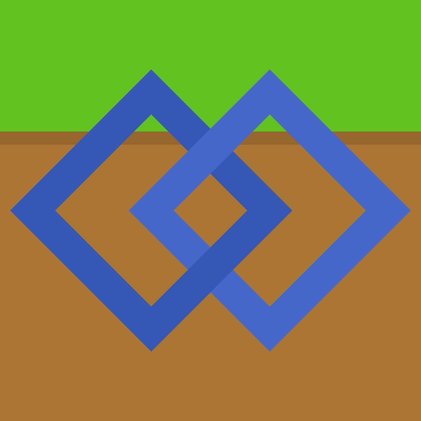
Maybe if zig-zag grass edge would be pixelated, then it would fit better?
from polymc.
konradmb
commented on May 29, 2024
Something like this, but more pro:

Also, MultiMC logo has the same "clash of styles", so it would be more recognizable to former users, but not too similar.

from polymc.
ZekeZDev
commented on May 29, 2024
Pixel art is great but most of the time it does not work very well in a logo since the image needs to scale a lot and be used in different places it does not make sense to make it pixel art. I dont really like having ouroboros in the logo and having it at such a small scale wont work well especially when its clashing styles
from polymc.
konradmb
commented on May 29, 2024
the image needs to scale a lot and be used in different places
You don't have to use the same icon at all scales. That's why freedesktop icon structure has all of those 16x16, 32x32 etc. folders. Take a look at what GIMP does with its smaller icons. The Wilber eyes are getting bigger and it loses its pencil at the smallest size. I've seen that Firefox does (or did lately) that too.

https://gitlab.gnome.org/GNOME/gimp/-/blob/master/desktop/256x256/gimp.png
https://gitlab.gnome.org/GNOME/gimp/-/blob/master/desktop/32x32/gimp.png
https://gitlab.gnome.org/GNOME/gimp/-/blob/master/desktop/16x16/gimp.png
from polymc.
ZekeZDev
commented on May 29, 2024
that is an option however with most modern applications you would just use an svg that works at most scales. It is a lot of effort to make it at different scales and unless the main focus is raster it doesnt make sense.
I also tested the mixed logo idea to see how it worked I dont think its bad but I am not convinced.

from polymc.
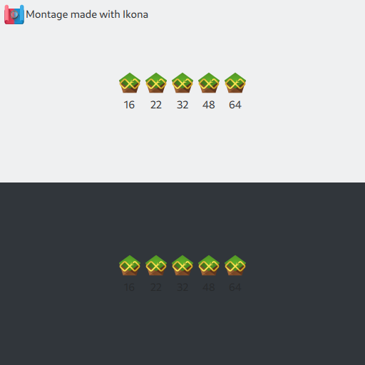
konradmb
commented on May 29, 2024
Looks good to me, in case of 16x16 you can even fallback to a simple infinity sign, or make ouroboros all black (without grey shadow). And something is wrong with this montage, because size for all variants is the same.
the main focus is raster
Well, the main focus should be raster, and that's what should be shipped for sure. You design your icons as vector, but convert them to raster for end-user. Take a look at the Freedesktop Icon Theme Specification - "Support for SVGs is optional."
GIMP ships both .png and .svg, but most of the time the png version for appropriate version is shown to me (in Gnome).
It is a lot of effort to make it at different scales
It is an effort, but not a lot of it. You simply make ~3 versions - for example: one for very small size (16x16), one for 32x32, and one big size (256x256). You create new versions mainly by deleting visible features. 😁
Another idea is that two versions are shipped: one symbolic (small, black-and-white) and one normal (big, colorful).
https://gitlab.gnome.org/GNOME/gnome-text-editor/-/tree/main/data/icons


KDE HIG says that:
Many icons come in multiple sizes. Each version should be visually optimized and pixel-perfect for its particular size. Larger sizes offer more opportunity for detail and visual pizazz, while smaller version should be stripped of everything not absolutely necessary.
from polymc.
ZekeZDev
commented on May 29, 2024
Another idea is that two versions are shipped: one symbolic (small, black-and-white) and one normal (big, colorful).
This is what I am more used to
from polymc.
konradmb
commented on May 29, 2024
I dont really like it
For me it's quite the opposite. With that pixelated grass I get instant Minecraft reference.
from polymc.
ZekeZDev
commented on May 29, 2024
only issue is how am I going to get the grass in the middle since the way shapes work
from polymc.
ZekeZDev
commented on May 29, 2024
also all the pixel detail looks like blur in icon view
from polymc.
ZekeZDev
commented on May 29, 2024

from polymc.
konradmb
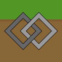
commented on May 29, 2024
only issue is how am I going to get the grass in the middle since the way shapes work
Maybe cut out this diamond? I don't know if it would look bad without it. 🤔

also all the pixel detail looks like blur in icon view
That's okay, you can't see small details at those sizes anyway. If you want you can tune it with a specific version as I mentioned earlier.
And something is wrong with this montage from Ikona, because size for all variants is the same. They should be at different sizes like here:

from polymc.
konradmb
commented on May 29, 2024
Maybe wait a while for a feedback from someone other than me 😅
from polymc.
ZekeZDev
commented on May 29, 2024
yeah my ikona is bugged but it still shows the 32px which is most common.
from polymc.
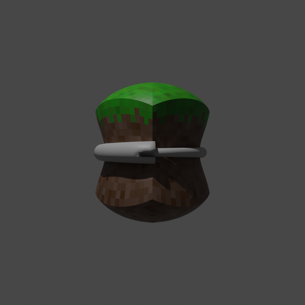
ZekeZDev
commented on May 29, 2024

heres latest I went back settling with the triangles since they just work better with the shape however I think this probably works the best and I guess in a way it sort of symbolises modding in minecraft having the hd grass but a low res "modded" snake
from polymc.
binex-dsk
commented on May 29, 2024
Okay, so I've merged @ZekeSmith 's new logo, and I think everything looks all good. If there are no objections, this will be closed
from polymc.
 GamzeeRakoon
commented on May 29, 2024
GamzeeRakoon
commented on May 29, 2024
im a part of the mc community so im going to voice my opinion, i am not a fan of the new logo.
imo its not unique enough, its just like every minecraft logo in existance the dirt block.
and its too simple.
i honestly prefer the gold block with the ororboro, its not perfect it could be better but atleast its unique.
from polymc.
iSeth500
commented on May 29, 2024

I never stopped working on the stretched cube idea. What about the ouroboro squeezing a block?
from polymc.
ZekeZDev
commented on May 29, 2024
im a part of the mc community so im going to voice my opinion, i am not a fan of the new logo. imo its not unique enough, its just like every minecraft logo in existance the dirt block. and its too simple.
i honestly prefer the gold block with the ororboro, its not perfect it could be better but atleast its unique.
While you arent wrong and I respect what your saying simple and familar isnt a bad thing. The gold block logo with ouroboros is very good however as I stated before it doesnt make sense for a minecraft launcher. Familarity is more important then uniqueness in this instace.
The yellow and gold logo also had other issues such as resembling political flags and symbolism that may not be desired.
from polymc.
ZekeZDev
commented on May 29, 2024
I actually really like this but I dont think it would work as a main icon mabye some 3d rended on the webpage or something else. Non the less great job!
from polymc.
iSeth500
commented on May 29, 2024
icon or not, it's fun to make.
from polymc.
ZekeZDev
commented on May 29, 2024
No thats respectable, I like it.
from polymc.
binex-dsk
commented on May 29, 2024
That looks pretty good!
Wouldn't hurt to make the snake's mouth bigger. Doesn't have to be Ouro but if you want to base it off of him it's fine
from polymc.
iSeth500
commented on May 29, 2024
Who is Ouro?
from polymc.
ZekeZDev
commented on May 29, 2024
The name of the snake that the original logo was based off. Ouroboros
from polymc.
iSeth500
commented on May 29, 2024
ohh! a wider mouth then?
from polymc.
iSeth500
commented on May 29, 2024

from polymc.
ZekeZDev
commented on May 29, 2024
Needs some tapering on the tail looks very good.
from polymc.
iSeth500
commented on May 29, 2024
Should the tail end be visible, or completely in-mouth?
from polymc.
binex-dsk
commented on May 29, 2024
in the mouth
from polymc.
iSeth500
commented on May 29, 2024

from polymc.
ZekeZDev
commented on May 29, 2024
@binex-dsk we should remove the pin on this issue. I would also highly reccomend we pin the two high issues: #7 #27
from polymc.
binex-dsk
commented on May 29, 2024
Okay, I will do this later. Can't right now because phone cope
from polymc.
ZekeZDev
commented on May 29, 2024
@binex-dsk you have pinned the others but this issue does not seem to be unpinned?
from polymc.
binex-dsk
commented on May 29, 2024
@binex-dsk you have pinned the others but this issue does not seem to be unpinned?
Because there was an objection and I need to make sure everyone agrees to this logo.
from polymc.
ZekeZDev
commented on May 29, 2024
Ahh ok understood.
from polymc.
GamzeeRakoon
commented on May 29, 2024
you can close the issue the icon has grown on me and i can agree on the stuff ZekeSmith said
from polymc.
binex-dsk
commented on May 29, 2024
ok
from polymc.
Related Issues (20)
- [RFC] Formatting Conventions HOT 2
- make PolyMC support Java 21 HOT 2
- More frequent versioning release HOT 2
- Instance Storage Tab uses hard to read font color on dark theme HOT 1
- [Question] Does the flatpak package also gets updated? HOT 3
- HomeBrew Installation instructions don't work. Not very important as you can still download PolyMC from GitHub HOT 2
- Launch instance failed: This instance is not compatible with Java version 21 HOT 2
- PolyMC doesn't auto-detect sdkman Java installations
- Importing BetterThanWolves causes hang only on PolyMC 6.0 HOT 3
- Add missing linux-arm natives
- polymc aur, make build in parallel HOT 1
- Unable to detect the forge installer! HOT 28
- Add a way to share mods/ressources pack/shader list from a configuration HOT 7
- [Feature Request]: add Amulet Map Editor support beside of MCEdit
- Integration with Ely.by HOT 11
- Cannot add "authlib-injector" account HOT 5
- Problems with the game (1.7.10) HOT 2
- Nix Overlay Install falure
- Unable to detect the forge installer HOT 5
- Shaderpacks from CurseForge end up in resourcepacks folder instead of shaderpacks
Recommend Projects
-
 React
React
A declarative, efficient, and flexible JavaScript library for building user interfaces.
-
Vue.js
🖖 Vue.js is a progressive, incrementally-adoptable JavaScript framework for building UI on the web.
-
 Typescript
TypeScript is a superset of JavaScript that compiles to clean JavaScript output.
-
TensorFlow
An Open Source Machine Learning Framework for Everyone
-
Django
The Web framework for perfectionists with deadlines.
-
 Laravel
A PHP framework for web artisans
-
D3
Bring data to life with SVG, Canvas and HTML. 📊📈🎉
-
Recommend Topics
-
javascript
JavaScript (JS) is a lightweight interpreted programming language with first-class functions.
-
web
Some thing interesting about web. New door for the world.
-
server
A server is a program made to process requests and deliver data to clients.
-
Machine learning
Machine learning is a way of modeling and interpreting data that allows a piece of software to respond intelligently.
-
Visualization
Some thing interesting about visualization, use data art
-
Game
Some thing interesting about game, make everyone happy.
Recommend Org
-
Facebook
We are working to build community through open source technology. NB: members must have two-factor auth.
-
Microsoft
Open source projects and samples from Microsoft.
-
Google
Google ❤️ Open Source for everyone.
-
Alibaba
Alibaba Open Source for everyone
-
D3
Data-Driven Documents codes.
-
Tencent
China tencent open source team.
from polymc.