Comments (26)
 parrt
commented on May 15, 2024
1
parrt
commented on May 15, 2024
1
For the text, you can pick an x and then ax.text(x, y, "37.3") but might have to turn off clipping at boundaries so it appears. Or, set xlim to 20% more and turn off tick marks/labels for that part then ax.text() there. beat it into submission!! haha
I had to get the wedges below the x axis and had to turn off clipping to do that. you can check the wedge code in my stuff for that.
from dtreeviz.
 tlapusan
commented on May 15, 2024
1
tlapusan
commented on May 15, 2024
1
For spacing, i think just shrink total height of graph maybe?
It shrinks a little, but there is still a lot of space. Because the standard deviation between dots is sigma=0.08, with mean = 0.5 (mu value). leaf index are from 1 to 1... tomorrow, I will play with different values for them.
from dtreeviz.
parrt
commented on May 15, 2024
1
wow! now that is a damn fine looking plot, sir! I will merge!
from dtreeviz.
tlapusan
commented on May 15, 2024
I'm not sure if i understood correctly. Would you like to include all the leaf split plots into a single new visualisation ?
Something similar with this ? :)

from dtreeviz.
parrt
commented on May 15, 2024
yep, that's it!!! Seems like it'd be useful just as the stacked histo is for classification
from dtreeviz.
tlapusan
commented on May 15, 2024
Cool ! Do you have any web resources/experience of how to include subplots (leaf sample'y distribution) into another plot using matplotlib ?
from dtreeviz.
parrt
commented on May 15, 2024
hahaha. i spent forever learning how to do that in this project. we shouldn't have to though. We can create a single plot that just does scattering with some noise for each leaf area. Here is sample code:
    mu = .5
    sigma = .08
    X = np.random.normal(mu, sigma, size=len(y))
    ax.set_xlim(0, 1)
    alpha = colors['scatter_marker_alpha'] # was .25

    ax.scatter(X, y, s=5, c=colors['scatter_marker'], alpha=alpha, lw=.3)
    ax.plot([0,len(node.samples())],[m,m],'--', color=colors['split_line'], linewidth=1)
So, basically, go to each leaf id and do a scatter that is x = id+noise and the y is just the y of samples at that leaf. make sense?
from dtreeviz.
tlapusan
commented on May 15, 2024
Nicee, I got the idea. I will start to implement it in the next days.
from dtreeviz.
tlapusan
commented on May 15, 2024
While thinking about this new visualisation, I have remember the boxplot from matplotlib. I guess it's what we need : https://matplotlib.org/3.1.1/gallery/statistics/boxplot_demo.html.
It can show a lot of build in stats, like median, mean, quartiles, outliers, etc (being a common visualisation in matplotlib, could be easier to interpret by other people)
@parrt what do you think ?

from dtreeviz.
parrt
commented on May 15, 2024
Only problem is that box plots are ugly ;) The alpha channel helps density and human eye is really good at picking up spread of data.
from dtreeviz.
tlapusan
commented on May 15, 2024
Indeed, box plot are a little ugly :)). I will take a look at the code that you mentioned
from dtreeviz.
tlapusan
commented on May 15, 2024
I have an intermediate visualisation.
Here is how it looks for a tree with depth=3:

depth=5:

depth=10:

As we can see, the visualisations become hard to read/interpret when we have a lot of leaves.
@parrt do you have any feedback, suggestions ?
from dtreeviz.
parrt
commented on May 15, 2024
looking interesting. for one we should tighten and fix the x direction so it's always the same. also dots should be bigger and then alpha channel can make darker areas show higher density. maybe graph is a bit too tall too. :) Maybe we add a show arg like rtree_univar that turns off x labels? Or maybe just show prediction to make smaller?
from dtreeviz.
tlapusan
commented on May 15, 2024
- 'for one we should tighten and fix the x direction so it's always the same.'
Do you mean to hardcode a fix value for figsize argument ? - 'also dots should be bigger and then alpha channel can make darker areas show higher density'
agree, we can also make the markersize configurable - 'Maybe we add a show arg like rtree_univar that turns off x labels? '
agree - Or maybe just show prediction to make smaller?
Do you mean to show only the horizontal black lines ?
from dtreeviz.
tlapusan
commented on May 15, 2024
@parrt could be an option to show the leaves in multiple plots when the number of leaves is big ?
Something like this :

from dtreeviz.
parrt
commented on May 15, 2024
Looking good! Yes, i suppose we could split up but that's harder to implement. maybe args that say leaf ID range min/max?
- 'for one we should tighten and fix the x direction so it's always the same.'
Do you mean to hardcode a fix value for figsize argument ?
I just meant that any specific leaf split plot should be same width; don't smear it out to fit graph width. Graph width is function of how many leaves I think. - 'also dots should be bigger and then alpha channel can make darker areas show higher density'
agree, we can also make the markersize configurable
yep - 'Maybe we add a show arg like rtree_univar that turns off x labels? '
agree
cool - Or maybe just show prediction to make smaller?
Do you mean to show only the horizontal black lines ?
That would work. I was earlier thinking that the x labels beneath graph would show just prediction value rather than num samples as well. just to make smaller.
from dtreeviz.
tlapusan
commented on May 15, 2024
I created a PR. We can add modifications on it.
I added the option to create more plots, with a specified number of leaves/plot (plot_leaf_count)
For 1 :
- I added a configurable figsize for the plot. In case of multiple plots, the last plot will keep the same width for leaves as others plots.
- Done
- in the end, I added show_leaf_labels bool parameter (similar with dtreeviz method), it seems to me more straightforward than show parameter (in case I don't want to display the x labels, I would have to initialize show=[]).
- removed the samples from the string.

from dtreeviz.
parrt
commented on May 15, 2024
Cool. What about just 20.4 not age=20.4 to make even smaller. Then make age the overall x label?
from dtreeviz.
parrt
commented on May 15, 2024
actually that might look weird like it's the x-value when in fact it's the leaf id. hmm...what if we put the predicted value at the top and then we don't actually need an x tick label? We'd just need "leaf id" or something for the grpah xlabel and then "age" for ylabel.
from dtreeviz.
tlapusan
commented on May 15, 2024
I created the horizontal implementation for visualisation. I like how it looks, it's a better option than multiple plots. I also added a configurable 'grid' parameter, which shows the grid in visualisation (it helps to identify leaf's dots).
I feel that we need to came up with better values for x, y labels (like you pointed up in previous comment).


from dtreeviz.
parrt
commented on May 15, 2024
Yeah, certainly repeating the target name is not optimal. I'd suggest something like:

Also let's try to keep things tightened up with perhaps less vertical space between leaves?
from dtreeviz.
tlapusan
commented on May 15, 2024
"Yeah, certainly repeating the target name is not optimal. I'd suggest something like:"
I will make a little research how to put the label in the right side of y axis.
"Also let's try to keep things tightened up with perhaps less vertical space between leaves?"
For this I will need to adjust the 'mu' and 'sigma' values and maybe the leaf index...
from dtreeviz.
parrt
commented on May 15, 2024
For spacing, i think just shrink total height of graph maybe?
from dtreeviz.
tlapusan
commented on May 15, 2024
- reduced the space between leaves. Created a parameter for these also (leaf_space)
- about y axis, I put "leaf prediction" as a label and leaf predictions for y ticks. I looks well for me, it makes the graph loaded with few information. @parrt what do you think ? :)

from dtreeviz.
parrt
commented on May 15, 2024
Looking better! I think it's confusing to see prediction on y. that should be "leaf" I think as you had it. :) also maybe double thick the prediction bars? Perhaps your split plots have a too-high variance, maybe tighten up more like

The idea is that it's kind of a "shaky line of dots". Might have to reduce alpha channel a bit depending on number of dots.
from dtreeviz.
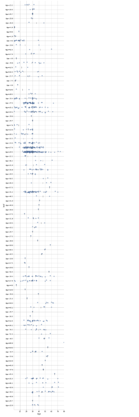
tlapusan
commented on May 15, 2024
hi @parrt.
- I added the y label in the right side of the plot.
- narrow the leaf dots visualisations
- double the prediction bars
Here it is how they look now :)


from dtreeviz.
Related Issues (20)
- from dtreeviz.trees import * Import necessary libraries HOT 1
- Color keyword argument - Value error HOT 14
- Add support for TensorFlow GradientBoostedTreesModel model
- _regr_leaf_viz calculates the mean for prediction value.
- WARNING:matplotlib.font_manager:findfont: Font family 'Arial' not found. HOT 2
- Decision Tree visualize wrong path HOT 1
- When using dataset that is different from the training for trees models - does not draw HOT 1
- Support for RandomForest HOT 5
- Visualize custom decision tree HOT 1
- how to use dtreeviz in streamlit HOT 2
- VisualisationNotYetSupportedError: get_min_samples_leaf() is not implemented yet for XGBoost. HOT 4
- TypeError: list indices must be integers or slices, not numpy.float64 HOT 5
- Crash when leaf nodes have no samples HOT 1
- Out of memory when calling viz.view() HOT 2
- Integrate AI explanation
- CatBoost need to be supported. HOT 1
- AttributeError: module 'dtreeviz' has no attribute 'model' on Windows platform, works fine on Google colab
- tfdf.keras.CartModel support? HOT 1
- TypeError: 'int' object is not subscriptable HOT 3
- Development requirement in `setup.py` HOT 1
Recommend Projects
-
 React
React
A declarative, efficient, and flexible JavaScript library for building user interfaces.
-
Vue.js
🖖 Vue.js is a progressive, incrementally-adoptable JavaScript framework for building UI on the web.
-
 Typescript
TypeScript is a superset of JavaScript that compiles to clean JavaScript output.
-
TensorFlow
An Open Source Machine Learning Framework for Everyone
-
Django
The Web framework for perfectionists with deadlines.
-
 Laravel
A PHP framework for web artisans
-
D3
Bring data to life with SVG, Canvas and HTML. 📊📈🎉
-
Recommend Topics
-
javascript
JavaScript (JS) is a lightweight interpreted programming language with first-class functions.
-
web
Some thing interesting about web. New door for the world.
-
server
A server is a program made to process requests and deliver data to clients.
-
Machine learning
Machine learning is a way of modeling and interpreting data that allows a piece of software to respond intelligently.
-
Visualization
Some thing interesting about visualization, use data art
-
Game
Some thing interesting about game, make everyone happy.
Recommend Org
-
Facebook
We are working to build community through open source technology. NB: members must have two-factor auth.
-
Microsoft
Open source projects and samples from Microsoft.
-
Google
Google ❤️ Open Source for everyone.
-
Alibaba
Alibaba Open Source for everyone
-
D3
Data-Driven Documents codes.
-
Tencent
China tencent open source team.
from dtreeviz.