Comments (11)
 mhsdesign
commented on May 31, 2024
4
mhsdesign
commented on May 31, 2024
4
@danielkestler thanks for your energy and input to make the ui better ;)
But honestly id much rather only focus on the workspace selector position in this thread.
Your super cutting edge designs might get lost here. So im proposing to move your redesign idea into a complete separate issue.
from neos-ui.
 danielkestler
commented on May 31, 2024
3
danielkestler
commented on May 31, 2024
3
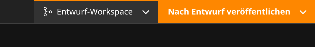
Okay, here you go. I'd suggest to connect these two dropdowns, as they are related to each other, and to change the color-scheme to make visible if we are in a non-live workspace.
Green for publishing into live, orange for publishing into draft workspaces (currently, it is always orange to symbolize that there are changes, but the action is "publish", so it should be green IMO – red for discarding would be nice).

from neos-ui.
danielkestler
commented on May 31, 2024
2
Just a super quick mockup of an alternate layout (of course missing some elements here):

from neos-ui.
 crydotsnake
commented on May 31, 2024
crydotsnake
commented on May 31, 2024
Are there any updates on this? :)
from neos-ui.
mhsdesign
commented on May 31, 2024
@crydotsnake i need feedback 😂
from neos-ui.
 markusguenther
commented on May 31, 2024
markusguenther
commented on May 31, 2024
@ahaeslich @mhsdesign Potentially a thing for 8.3?
from neos-ui.
 ahaeslich
commented on May 31, 2024
ahaeslich
commented on May 31, 2024
I would like it to be included
from neos-ui.
danielkestler
commented on May 31, 2024
I think it's not only the workspace selector – there are more inconsistencies from a UX-perspective. Some thoughts and examples:
- Edit mode selector (direct edit / raw view etc.) is placed in the primary toolbar. Why? It has no global meaning, it belongs to the actual page preview / rendering (the guest iframe).
- User account selector is in the primary toolbar. That's maybe okay, one could discuss about this. Could also be moved to the toggle menu in the burger menu.
- What has a global meaning then, you may ask? IMO two things:
- Currently selected site (in a multisite installation), probably with site switcher
- Currently selected workspace / branch (maybe even more relevant if the ESCR is ready)
- Currently selected node variant / language
- Panes need a lot of space. Basically, you have:
- Document Tree
- Content Tree / Outliner
- Selected node properties
Do we need them all at the same time?
- The toolbar directly above the guest iframe is a bit weird. There are contextual buttons there (formatting of text) which could be inlined to the actual inline editor, and preview settings like fullscreen, open preview link and the keyboard shortcuts (???).
Maybe we should rethink the interface and make it more consistent, e.g.
- Primary toolbar to only contain application (or at least "view-wide") buttons and settings
- Secondary toolbar to contain settings at the document level (like fullscreen, preview link, edit modes, ... selected node?)
- Floating toolbars that appear in the right context (e.g. formatting buttons directly above selected text)
This is of course a huge task to tackle on, not something for the 8.3 release. Maybe for 9? If we even decide to do this ...
from neos-ui.
mhsdesign
commented on May 31, 2024
@danielkestler I think we achieved already some more organization with #3227
from neos-ui.
danielkestler
commented on May 31, 2024
Would also love to see detachable/attachable inspectors here ...

from neos-ui.
 PRGfx
commented on May 31, 2024
PRGfx
commented on May 31, 2024
The distinction against the "live" workspace shouldn't be so hard-coded imo, as there may be editing workflows where some users may never work with the "live" workspace. I'm not sure whether there is a way to determine the "most basic" workspace for the current user..
The topic of distinction by color and the neos color palette are there own issues, but new mistakes should be avoided for new features, I think.
I'm a bit concerned about a separate button, that's probably not always there or active:
is it taking up space, even if there aren't multiple workspaces available for the user? To show a link to the workspaces module in case the project normally wouldn't use workspaces but now wants to start? (so only available to users that can manage workspaces?)
Would the button be available when I can't change the workspaces, as I have changes in my user-workspace? Would it then show me some info like "can't change workspace, you have changes, review them [here]", somewhat pointing to the other dropdown? (Publishing and reviewing changes should stick together imo.) Or it sometimes is a button and sometimes it's just the text?
Changing the button whenever the dirty-state of the workspace changes, seems confusing to me.
I see where this issue is coming from, but other than the current implementation of the nested dropdown, I think the context makes sense. The publish-button already conveys which workspace I'm in (however it may of course be more expressive in that..).
I don't think it's without problems, but maybe it could be implemented as some kind of submenu, maybe completely replacing the dropdown - depends a bit about the complexity of the intended content, i.e. if there should be some kind of tree-visualization about how workspaces are related
┌───────────┬─┐     ┌─┬──────────┐
│O Live     │>│     │<│Workspace │
├───────────┴─┤     ├─┴──────────┤
│n Changes    │     │O Live*     │
├─────────────┤ ──► ├────────────┤
│Review       │     │  0 Review  │
├─────────────┤     ├────────────┤
│...          │     │  ...       │
└─────────────┘     └────────────┘
The labels should probably be more elaborate about concerning workspaces.. I liked the proposal of different markings for read-only workspaces.
from neos-ui.
Related Issues (20)
- TASK: 9.0 remove leftover manual context path string operations HOT 1
- BUG: Neos9 `ReferenceEditor` `createNew` doesnt work HOT 1
- BUG: Children of previously opened node are missing after search
- EPIC: Neos 9.0 Conflict Resolution
- FEATURE: Lock the UI and present a modal during publish/discard
- FEATURE: Offer resolution strategies when conflicts arise during rebase HOT 2
- FEATURE: Iframe error handling with proper user feedback
- BUG: NodeCreationDialog should not submit empty string for optional fields
- BUG: View DataSource should Update on base workspace change HOT 2
- FEATURE: Offer rebase option when publish/discard fails due to conflict
- FEATURE: Extend insert mode dialog and moving nodes for dimension handling
- BUG: Missing document node leads to exception when opening `/neos/content?node=...` HOT 1
- Upmgerge #3708 to Neos 9
- TASK: Replace `NeosUiDefaultNodesOperation` with `ReloadNodesQueryHandler`
- BUG: DateTimeEditor does not show a leading 0 for minutes < 10
- Ease up-merging changes after new release HOT 2
- BUG: Neos Ui version shown as `vundefined`
- BUG: The new conflict resolution e2e tests are sadly a bit flaky in ci :O
- BUG: 9.0 `change-base-workspace` is infinite loop and times out - always?!!
- Discussion: Neos UI (internal) api refactoring
Recommend Projects
-
 React
React
A declarative, efficient, and flexible JavaScript library for building user interfaces.
-
Vue.js
🖖 Vue.js is a progressive, incrementally-adoptable JavaScript framework for building UI on the web.
-
 Typescript
TypeScript is a superset of JavaScript that compiles to clean JavaScript output.
-
TensorFlow
An Open Source Machine Learning Framework for Everyone
-
Django
The Web framework for perfectionists with deadlines.
-
 Laravel
A PHP framework for web artisans
-
D3
Bring data to life with SVG, Canvas and HTML. 📊📈🎉
-
Recommend Topics
-
javascript
JavaScript (JS) is a lightweight interpreted programming language with first-class functions.
-
web
Some thing interesting about web. New door for the world.
-
server
A server is a program made to process requests and deliver data to clients.
-
Machine learning
Machine learning is a way of modeling and interpreting data that allows a piece of software to respond intelligently.
-
Visualization
Some thing interesting about visualization, use data art
-
Game
Some thing interesting about game, make everyone happy.
Recommend Org
-
Facebook
We are working to build community through open source technology. NB: members must have two-factor auth.
-
Microsoft
Open source projects and samples from Microsoft.
-
Google
Google ❤️ Open Source for everyone.
-
Alibaba
Alibaba Open Source for everyone
-
D3
Data-Driven Documents codes.
-
Tencent
China tencent open source team.
from neos-ui.