Comments (7)
 ARundle01
commented on July 28, 2024
ARundle01
commented on July 28, 2024
Hi Joseph, thanks for your interest in my library! I had intended for the mkdocs to cover the usage of pycart, but coming back to this after a year away I can see it isn't as clear as I had thought 😄
All the code used to generate images for the associated dissertation can be found in main.py; this might provide a little more insight into how I had used it with a real dataset, but I understand that it's not the most readable.
Do you have a particular dataset in mind for displaying on the graph gallery, or what you have in mind for the article in general? I'd be more than happy to take a look and see if I can come up with a more targeted example.
from ecmm428-pycart.
 JosephBARBIERDARNAL
commented on July 28, 2024
JosephBARBIERDARNAL
commented on July 28, 2024
for example I have this dataset about co2 per capita across europe that I'd like to plot:
import geopandas as gpd

data = gpd.read_file('https://raw.githubusercontent.com/JosephBARBIERDARNAL/misc-dataviz/main/country-co2/data.geojson')
As for the article, ideally I'd probably write 2 or 3 to go from the simplest use case to an advanced 'real life' chart. Probably something like this
Do you have an idea of the best way to create the cartogram? Also, the posts will probably describe what cartograms are in general
from ecmm428-pycart.
ARundle01
commented on July 28, 2024
No worries, this data is actually already formatted perfectly for pycart. I've written a really basic script below that takes your data and plots a simple dorling cartogram (where countries are represented as circles of size proportional to their value field, in this case Co2 per Capita).
In this case, I'm creating a Cartogram object by supplying the dataframe and the headings on which to operate. I can then run the dorling() method on the Cartogram object, which returns the cartogram as a new dataframe. I then plot the dorling cartogram over the top of the base map of Europe, using GeoDataFrame's built-in plot().
You can follow the same method to generate a non-contiguous cartogram (where the countries are scaled on their centre-point proportional to the value field), by replacing the dorling() method with non_contiguous().
    fig, ax = plt.subplots(1)
    ax.axis('equal')
    ax.axis('off')

    gdf = gpd.read_file('https://raw.githubusercontent.com/JosephBARBIERDARNAL/misc-dataviz/main/country-co2/data.geojson')
    gdf['geometry'] = gdf['geometry'].to_crs(crs=3857)

    gdf.plot(color='w', ax=ax, zorder=0, edgecolor='0', linewidth=0.1, legend=False)

    cart = cartogram.Cartogram(gdf, 'co2Capita', 'country', 'geometry')
    dorling = cart.dorling(iterations=100, stop=None)

    dorling.plot(color='w', ax=ax, zorder=0, edgecolor='0', linewidth=0.1, legend=False)

    # Plot Figure
    plt.savefig("./out/testing.png", dpi=1200)
If you're looking for the fancier, density-equalizing cartograms like this, unfortunately I haven't implemented those (yet, depending on if I get time outside of work).
from ecmm428-pycart.
ARundle01
commented on July 28, 2024
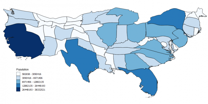
The image itself looks like this:

from ecmm428-pycart.
JosephBARBIERDARNAL
commented on July 28, 2024
Yes, I'm mainly looking for density-equalising cartograms ^^, as in the example below. Thanks for your example though, but it's less in line with what we'd like to add to the python graph gallery

I have no idea how complex it is to implement? This already exists in R but unfortunately we don't have much in Python
from ecmm428-pycart.
ARundle01
commented on July 28, 2024
Yeah, I had tried to implement this previously but had little success. Unfortunately given the amount of time I have outside of work, I won't be able to implement this any time soon.
from ecmm428-pycart.
JosephBARBIERDARNAL
commented on July 28, 2024
Completly understand! wish you the best
from ecmm428-pycart.
Related Issues (1)
Recommend Projects
-
 React
React
A declarative, efficient, and flexible JavaScript library for building user interfaces.
-
Vue.js
🖖 Vue.js is a progressive, incrementally-adoptable JavaScript framework for building UI on the web.
-
 Typescript
TypeScript is a superset of JavaScript that compiles to clean JavaScript output.
-
TensorFlow
An Open Source Machine Learning Framework for Everyone
-
Django
The Web framework for perfectionists with deadlines.
-
 Laravel
A PHP framework for web artisans
-
D3
Bring data to life with SVG, Canvas and HTML. 📊📈🎉
-
Recommend Topics
-
javascript
JavaScript (JS) is a lightweight interpreted programming language with first-class functions.
-
web
Some thing interesting about web. New door for the world.
-
server
A server is a program made to process requests and deliver data to clients.
-
Machine learning
Machine learning is a way of modeling and interpreting data that allows a piece of software to respond intelligently.
-
Visualization
Some thing interesting about visualization, use data art
-
Game
Some thing interesting about game, make everyone happy.
Recommend Org
-
Facebook
We are working to build community through open source technology. NB: members must have two-factor auth.
-
Microsoft
Open source projects and samples from Microsoft.
-
Google
Google ❤️ Open Source for everyone.
-
Alibaba
Alibaba Open Source for everyone
-
D3
Data-Driven Documents codes.
-
Tencent
China tencent open source team.
from ecmm428-pycart.