apexcharts / apexcharts.js Goto Github PK
View Code? Open in Web Editor NEW📊 Interactive JavaScript Charts built on SVG
Home Page: https://apexcharts.com
License: MIT License
📊 Interactive JavaScript Charts built on SVG
Home Page: https://apexcharts.com
License: MIT License


![dependabot[bot] avatar](https://avatars.githubusercontent.com/in/29110?v=4 "dependabot[bot]")


i mean the chart with a label of 'Percent'.
it seems that the color of this chart is linear-gradiented by the round path. I've done some research and was disappointed to find out that in modern browsers we cannot make that ( in android we may ) since the only two color gradients that v8 supports do not match this requirement.
Is it possible to entirely hide y axes and have the chart plot area fill the whole space?
I've tried using a yaxis config like this:
{
  axisTicks: {
    show: false
  },
  axisBorder: {
    show: false
  },
  labels: {
    show: false
  },
  title: {
    text: ""
  }
}
That hides the y axes but leaves a blank space. I've tried setting various width properties to 0 too, but it comes out the same. Is there a way to hide the y axis (or axes) completely and have the chart plot area fill the whole horizontal space?
If the text is a bit long, it is shown above the options, and if window size is small, text is not displayed properly.
Codepen


Would be nice to auto-select the Zoom tool after initialization
After using the Zoom tool you can't zoom out fully, only by using the Reset button (home icon)
The company I work for, would like to contribute to this issue by making an Angular 4+ wrapper for Apex charts. We specialize in Angular 4+ having a large portfolio of Angular projects. Let me know if you're interested. 😃
On a donut chart (did not check other types) the tooltip.y.formatter and yaxis.labels.formatter are never called. Therefore values cannot be formated properly.
Thanks for your great works. Its so simply nice library.
Btw, I found broken urls in the demo page.
Could you check it out please?
demo page
https://apexcharts.com/javascript-chart-demos/radialbar-charts/
Under this link https://apexcharts.com/javascript-chart-demos/line-charts/zoomable-timeseries/
there is this code
 var ts2 = 1484418600000;
    var dates = [];
    var spikes = [5, -5, 3, -3, 8, -8]
    for (var i = 0; i < 120; i++) {
      ts2 = ts2 + 86400000;
      var innerArr = [ts2, dataSeries[1][i].value];
      dates.push(innerArr)
    }

    var options = {
      chart: {
        type: 'area',
        stacked: false,
        height: 380,
        zoom: {
          enabled: true
        },
      },
      plotOptions: {
        line: {
          curve: 'smooth',

        }
      },
      dataLabels: {
        enabled: false
      },
      series: [{
        name: 'XYZ MOTORS',
        data: dates
      }],
      markers: {
        size: 0,
        style: 'full',
      },
      //colors: ['#0165fc'],
      title: {
        text: 'Stock Price Movement',
        align: 'left'
      },
      fill: {
        gradient: {
          enabled: true,
          shadeIntensity: 1,
          inverseColors: false,
          opacityFrom: 0.35,
          opacityTo: 0,
          stops: [0, 70, 80, 100]
        },
      },
      yaxis: {
        min: 20000000,
        max: 250000000,
        labels: {
          formatter: function (val) {
            return (val / 1000000).toFixed(0);
          },
        },
        title: {
          text: 'Price'
        },
      },
      xaxis: {
        type: 'datetime',
      },

      tooltip: {
        shared: false,
        y: {
          formatter: function (val) {
            return (val / 1000000).toFixed(0)
          }
        }
      }
    }

    var chart = new ApexCharts(
      document.querySelector("#chart"),
      options
    );

    chart.render();
Where is dataSeries[1][i].value defined?
It's definitely not an issue but I feel like paning works in a bit unpredictable way.
A simple scenario: I would like to zoom in a line chart, pan it left and zoom in again. In this case I need to go back and forth to the toolbar selecting a "zoom in" icon first, then a "pan" icon and then a "zoom in" icon again. In a meantime chart goes randomly left or right because in "paning mode" it follows mouse moves and it's horribly hard to escape from chart area without moving a chart itself :)
Ideally, I would combine pan & zooming and would use mouse-down event for selecting area to zoom (as it is already done), and mouse-down + shift or control key to pan a chart. That would save constant switching between pan/zoom tools and would make paning itself way more convenient.
If you think it's ridiculous idea, feel free to close this issue :)
Anyway, awesome library. Thanks for great work.
apex-charts is really great , but I unable found to declaration file to easier development.
using this configuration
const config = {
	chart: {
      width: 380,
      type: 'donut',
    },
    series: [44, 55, 41, 17, 15],
    legend: {
      show: false
    },
    plotOptions: {
      pie: {
        dataLabels: {
          name: {
            show: false
          },
          value: {
            show: false
          }
        }
      }
    }
}
This comes out

Any idea how to hide labels?
Your demo images need alt text or titles - labeling as appropriate: https://css-tricks.com/accessible-svgs/
Feels like something is wrong with the way Apexcharts remember the state of the chart (at least for line type).
I use one instance of apexcharts, where depending the category the user choose from a select input, the js asynchronously fetch for data, and inject series and config into apexcharts.
This works but it break quite some functionnalities :
FIrst the zoom is broken (since the latest version of apexcharts it seems), whatever zoom tool takes the axis ranges from the default data shown at first render.
Also the reset zoom reinject default series.
Maybe I missed something in the docs ?
See the gif :

I am attempting to utilize a rollup summary pie chart to filter a bar chart to only show related data to that specific pie chart category or categories. I am writing in the dataPointSelection event as some of the samples show using the histogram or bar charts and cannot get the event to fire off when selecting one of pie slices. At this point, just to test for functionality I am logging to the console. The click event triggers as expected per the documentation, however, the dataPointSelection event does not. Is there something I am missing with the pie and donut charts to determine when a user selects a pie slice category and determine what they selected?
Sample code below:
<!DOCTYPE html>
<html lang="en">
<head>
    <meta charset="UTF-8">
    <meta name="viewport" content="width=device-width, initial-scale=1.0">
    <meta http-equiv="X-UA-Compatible" content="ie=edge">
    <title>Document</title>
</head>

<body>
    <div id="chartpie" style="width: 400px; height: 400px; margin: 35px auto;border-style: solid;
    border-width: 1px;border: 1px solid #ddd; box-shadow: 0 22px 35px -16px rgba(0,0,0, 0.1);">
</div>

<script type="text/javascript">
    let options_pie = {
      chart: {
          width: 400,
          height: 400,
          type: 'pie',
          dropShadow: {
            enabled: true,
            blur: 8,
            top: 8,
            opacity: 0.1
          },
          events: {
            dataPointSelection: function(e, chart, opts) {
              console.log("Inside the dataPointSelection Event");
            },
            click: function(e, chart, opts) {
                console.log("Inside the click Event");
            }
          }
      },
      stroke: {
        width: 0
      },
      series: [44, 55, 41, 17, 15],
      title: {
          text: 'Title Text',
          offsetX: 30,
          style: {
            fontSize: '24px'
          }
        },
        subtitle: {
          text: 'Subtitle Text',
          offsetX: 30,
          style: {
            fontSize: '14px'
          }
        },
        labels: ["Category 1", "Category 2", "Category 3", "Category 4", "Category 5"]
    }

    let chart_pie = new ApexCharts(document.querySelector("#chartpie"), options_pie);
    chart_pie.render();

  </script>
  <script src="apexcharts.min.js"></script>
</body>
</html>
Tooltip not showing in bar charts as in line charts, it is displayed outside the chart div.

How to change xaxis labels colors?
I'm using this configuration
const options = {
	chart: {
      height: 200,
      type: 'bar',
    },
    plotOptions: {
      bar: {
        horizontal: true
      }
    },
    dataLabels: {
      enabled: false,
    },
    stroke: {
      show: false,
      width: 1,
      colors: ['#fff']
    },
    series: [{
      name: 'Competition',
      data: [44, 55, 41, 64, 20]
    }, {
      name: 'Me',
      data: [53, 32, 33, 52, 10]
    }],
    colors: ['#F47B20', '#005596'],
    legend: {
      show: false,
      position: 'top'
    },
    grid: {
      show: false
    },
    xaxis: {
      categories: ['Alpha bank', 'Eurobank', 'Τράπεζα πειραιώς', 'Εθνική τράπεζα', 'Attica Bank'],
      labels: {
        show: true,
        style: {
          color: 'blue',
          fontSize: '12px'
        },
      }
    }
}Clicking on reset in the interactivity tabs option not only reset zoom, and selections, but it also remove any data received by asynchronous request.
I think this is misleading in some ways, since it deletes any modification of the chart but the very initial state.
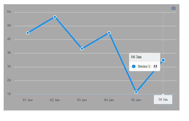
When using the Sparklines (or others graphic in a dasboard for example), it would be nice to be able to display the tooltip at the same on other graphs sharing the same X Axis.
It's the case in the sample Sales / Expenses / Profits, where on hover, it's good to see the Profits, but it's hard to see if it's based on increase of Sales or Expenses:

I understand a combined graph could resolved it, but it will not be as beautiful as 3 sparklines.
Perhaps adding an event for tooltip, and the ability to display the tooltip on another chart (like the sync charts method with updateOptions?).
Thanks for the library very helpful.
Hello - I'm trying to figure out how I can implement a stacked bar graph WITH a line. Whenever "stacked = True," the columns are parallel and not stacked. Only 1 axis is required. I'm looking forward to working with Apex Charts - really good stuff.
Thanks,
Since the legend is part of the SVG, and you can't provide height and width altogether, on vertical screen on mobile, there is a lot of problems of readability on mobile phone. I've got a six lines chart on my page, and the legend is not displayed due to to the SVG not planning vertical space for it.
I could disable legends, but it would be hard to read which color is which line. An implementation of this would be to set a size to the legend group then add that size to a translate variable to the chart or the legend group depending the position of the legend.
To test on it, just use a small width for apexcharts, like 350px (95% width of my phone display).
Here the examples :


We are on the way of replacing Chartist with Apex and some charts have an aspect ratio specified (instead of height) to make the chart truly responsive.
Here's a list of supported ARs https://codepen.io/jesperkc/pen/EyWevN and it would be nice to have these in Apex too.

Is there any way to make the gray background of the 3 datasets transparent?
The link https://apexcharts.com/docs/options/datalabels/ points to grid docs
There is some UI elements in apexcharts that are locked into english, like date format. Even if we can configure the way it's displayed, we can't have the config format the date in another language.
Just let the datetimeFormatter object takes the localization token.
Vanilla JS takes it like with a simple string like 'FR-fr' as parameter of toLocaleString()
When making charts that have float/decimal values, the values always round. This makes it extremely annoying for plotting data under 1. Right now I have a workaround so that I can see the actual value on hover by setting the formatter like:
options.yaxis.labels.formatter = val => val.toFixed(2)
However there doesn't seem a way to get any non integer ticks to show up. Therefore if all data is between 0 and 1, you'll only be able to see two ticks: 0 and 1.
P.S. Thanks for the great library! A lot easier to use than chart.js for simple stuff.
I can see in the demos that clicking on a pie slice expands its radius, but I couldn't find anything in the docs about it.
Ideally, I would like to build a pie where any slice can be offset x pixels/percent from the centre point.
Less ideal, but perhaps easier: there is clearly already a function for expanding a slice's radius (on click), but it would be nice to be able to access it (so that it can be rendered with a slice in an expanded state, without having to click).
Here : https://apexcharts.com/docs/options/responsive/
Just lack the object around the properties like that :
responsive: [{
    breakpoint: undefined,
    options: {},
}]
It seems to have an issue when a Sparkline chart is rendered first in a page, and then after a "classic" chart is rendered.
The "classic" chart will not display the yAxis, even if we force it with options, or changing properties.
I have created a CodePen to show the issue: https://codepen.io/lthomas/pen/djBedE
At the end of the JS section, there are the two lines that can be reversed to reproduced the issue:
By rendering the sparkline after the chart, everything looks fine.
chart.render();
sparkline.render();
By rendering the sparkline before the chart, the chart does'nt display the yAxis.
sparkline.render();
chart.render();
As the zoom object is selected by default, setting :
zoom: {
    enabled: false
}
Just hide zoom tools, but do not disable the ability to zoom by clicking without choosing a tool.
Maybe add a "none" object to autoselected toolbar property and set it by default (or hint about this in the documentation).
I am experiencing a critical memory leak issue when trying to access https://apexcharts.com/javascript-chart-demos/
I'm using Firefox Developer Edition 62.0b15 (64-bit), on Debian 9.5 "Stretch".
Here is a video proof (youtube link). You can clearly see the CPU going crazy at around 15 to 20 seconds in the video, only a few moments after loading the page. Then, the memory starts filling up rapidly, eventually eating through swap space, at that point i have no choice but to kill Firefox to keep my system stable.
I do have a few addons installed on the browser, but i do not believe that they have any impact on the issue.
Is anyone able to reproduce this behavior?
Hey there!
I've tried to create a line-chart with the vue-apexcharts.
However I guess the issue is related to the core.
It seems that the stroke.lineCap option has no effect.
According to the docs the lineCap should have three options: butt, square and round however neither of those is changing the line chart. I am aiming for the round option but the ends of the stroke are not rounded at all.
Changing the option to butt or square also seems to have no effect.

<template>
  <chart
    :options="options"
    :series="series"
    type="line"
    width="550"
  />
</template>

<script>
import VueApexCharts from 'vue-apexcharts'

export default {
  name: 'LineChart',
  components: {
    chart: VueApexCharts
  },
  props: {
    colors: {
      type: Array,
      default: () => (['#0064AD', '#00925B'])
    }
  },
  data: () => ({
    options: {
      chart: {
        id: 'line-chart',
        toolbar: {
          show: false
        }
      },
      stroke: {
        show: true,
        curve: 'smooth',
        lineCap: 'round',
        width: 4
      },
      colors: [],
      xaxis: {
        categories: ['Jan', 'Feb', 'Mar', 'Apr', 'May', 'Jun', 'Jul', 'Aug', 'Sep']
      },
      yaxis: {
        min: 0
      },
      markers: {
        size: 0
      }
    },
    series: [{
      name: 'Anzahl Arten',
      data: [20, 50, 10, 80, 100]
    }, {
      name: 'Anzahl Nachweise',
      data: [10, 10, 5, 40, 20]
    }]

  }),
  created () {
    this.options.colors = this.colors
  }
}
</script>When I import the "import ApexCharts from 'apexcharts' " undefined is not an object (evaluating 'e.createElementNS') React-Native this error occurs.
I want to add a array of tooltip to my donut chart. This is my chart

Hi, first thanks for Apexcharts it looks awesome !
I would like to know if you plan to add new chart to the lib and more i'm especially looking for a radar chart ?
When data is updated the donut chart has awkward animations. Even when just changing the color for instance:

Hi,
I'm using Apexcharts in a Vue 2 project and currently calling the render() method within the component mounted() method. Now I get the two charts to render however it only displays on hot-reloading after saving new changes to a file. Not when the page hard-reloads.
I receive this error when the page with the charts loads from a page refresh:
apexcharts.min.js?2227:1 Error: <rect> attribute width: A negative value is not valid. ("-2.45")
this is my markup:
<div>
   <div ref="linechart"></div>
   <div ref="barchart"></div>
</div>
Here is what my chart data looks like:
data: () => {
    return {
      chartOne: {
        chart: {
          type: 'line',
          height: 380
        },
        stroke: {
          width: 3,
          curve: 'smooth'
        },
        series: [{
          name: 'sales',
          data: [ 30, 40, 35, 50, 49, 60, 70, 91, 125, 150 ]
        }],
        xaxis: {
          categories: [ 'JAN', 'FEB', 'MAR', 'APR', 'MAY', 'JUN', 'JUL', 'AUG', 'SEP', 'OCT', 'NOV', 'DEC' ]
        }
      },
      chartTwo: {
        chart: {
          type: 'bar',
          height: 380
        },
        series: [{
          name: 'sales',
          data: [ 30, 40, 35, 50, 49, 60, 70, 91, 125, 150 ]
        }],
        xaxis: {
          categories: [ 'JAN', 'FEB', 'MAR', 'APR', 'MAY', 'JUN', 'JUL', 'AUG', 'SEP', 'OCT', 'NOV', 'DEC' ]
        }
      }
    }
Here is what my mounted() function looks like:
let chart = new ApexCharts(this.$refs.linechart, this.chartOne)
    chart.render()
let barchart = new ApexCharts(this.$refs.barchart, this.chartTwo)
    barchart.render()
Any idea what's happening here? I'm so confused what's causing this error
When you filter out all series (legend) the control goes blank.
It would be really awesome if along with SVG, apexcharts can provide a way to download the graph in Excel, png/jpeg and pdf formats.
Anotations in stacked bar charts don't show at all
Is there a way to add multiple annotations based on array of data ?
something like this

This configuration
{
  "chart": {
    "height": "360px",
    "width": "100%",
    "type": "area",
    "foreColor": "#fff"
  },
  "stroke": {
    "curve": "smooth"
  },
  "series": [
    {
      "name": "One",
      "data": [
        262,
        81,
        3
      ]
    },
    {
      "name": "Two",
      "data": [
        1,
        62,
        448
      ]
    }
  ],
  "title": {
    "text": "",
    "align": "left"
  },
  "legend": {
    "show": false
  },
  "grid": {
    "show": true,
    "borderColor": "transparent"
  },
  "xaxis": {
    "type": "categories",
    "categories": [
      "One",
      "Two",
      "Three"
    ]
  }
}
looks like this

However this configuration
{
  "chart": {
    "height": "360px",
    "width": "100%",
    "type": "area",
    "foreColor": "#fff"
  },
  "stroke": {
    "curve": "smooth"
  },
  "series": [
    {
      "name": "μεταβλητή-0",
      "data": [
        175,
        498,
        375
      ]
    },
    {
      "name": "μεταβλητή-1",
      "data": [
        268,
        385,
        352
      ]
    }
  ],
  "title": {
    "text": "",
    "align": "left"
  },
  "legend": {
    "show": false
  },
  "grid": {
    "show": true,
    "borderColor": "transparent"
  },
  "xaxis": {
    "type": "categories",
    "categories": []
  }
}
The chart looks like this

Note that on the second chart, the third label is hidden.
I want the margins to shorten or disappear, what should I do? 🤔
IE11 not working
Would be great if apexcharts can provide React Components. That will give nice declarative experience out of the box.
I took the spark1 from the spark line demo and tried to append data by adding the following:
setInterval(function() {
  spark1.appendData({
    data: [ 20 ]
  });
}, 300);
The data is not appended and 'dfsfgdgdgdf' is printed to the console every 300:th ms. Looking in the source code there is a random console log there:
apexcharts.js/src/modules/ZoomPanSelection.js
Line 203 in 8281a07
Tried height: '100%', Is there any way to make the chart height-responsive?
Updating chart color doesn't seem to have any visible effect:
chart.updateOptions({
  colors: ["#00FF00"]
})
Here's a simple react component implementation example, with initial chart color set to red:
Expected behavior when chartColor changes:
Actual behavior:
Not sure what happens here, but I'm guessing that it simply merges the colors array, resulting in ["#FF0000", "#00FF00"], but that's obviously not what I want. I want to change the existing color.
  import React from "react"
  import ApexCharts from 'apexcharts'

  class Chart extends React.Component {

    componentDidMount() {
      var options = {
        colors: ["#FF0000"],
        chart: {
          type: 'bar'
        },
        series: [{
          name: 'sales',
          data: [30, 40, 35, 50, 49, 60, 70, 91, 125]
        }],
        xaxis: {
          categories: [1991, 1992, 1993, 1994, 1995, 1996, 1997, 1998, 1999]
        }
      }

      this.chart = new ApexCharts(document.querySelector("#chart"), options)
      this.chart.render()
    }

    componentDidUpdate(prevProps) {
      if (this.props.chartColor !== prevProps.chartColor) {
        this.chart.updateOptions({
          colors: ["#00FF00"],
          xaxis: {
            labels: {
              show: false
            }
          },
        })
      }
    }

    render() {
      return (
        <div id="chart"></div>
      )
    }
  }

  export default Chart
Hi, it would be nice if this library could support candlesticks chart, and perhaps other financial charts
A declarative, efficient, and flexible JavaScript library for building user interfaces.
🖖 Vue.js is a progressive, incrementally-adoptable JavaScript framework for building UI on the web.
TypeScript is a superset of JavaScript that compiles to clean JavaScript output.
An Open Source Machine Learning Framework for Everyone
The Web framework for perfectionists with deadlines.
A PHP framework for web artisans
Bring data to life with SVG, Canvas and HTML. 📊📈🎉
JavaScript (JS) is a lightweight interpreted programming language with first-class functions.
Some thing interesting about web. New door for the world.
A server is a program made to process requests and deliver data to clients.
Machine learning is a way of modeling and interpreting data that allows a piece of software to respond intelligently.
Some thing interesting about visualization, use data art
Some thing interesting about game, make everyone happy.
We are working to build community through open source technology. NB: members must have two-factor auth.
Open source projects and samples from Microsoft.
Google ❤️ Open Source for everyone.
Alibaba Open Source for everyone
Data-Driven Documents codes.
China tencent open source team.